Old book, new tricks.
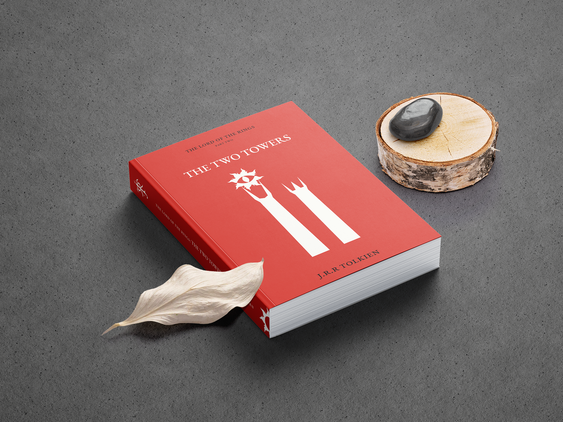
Cover
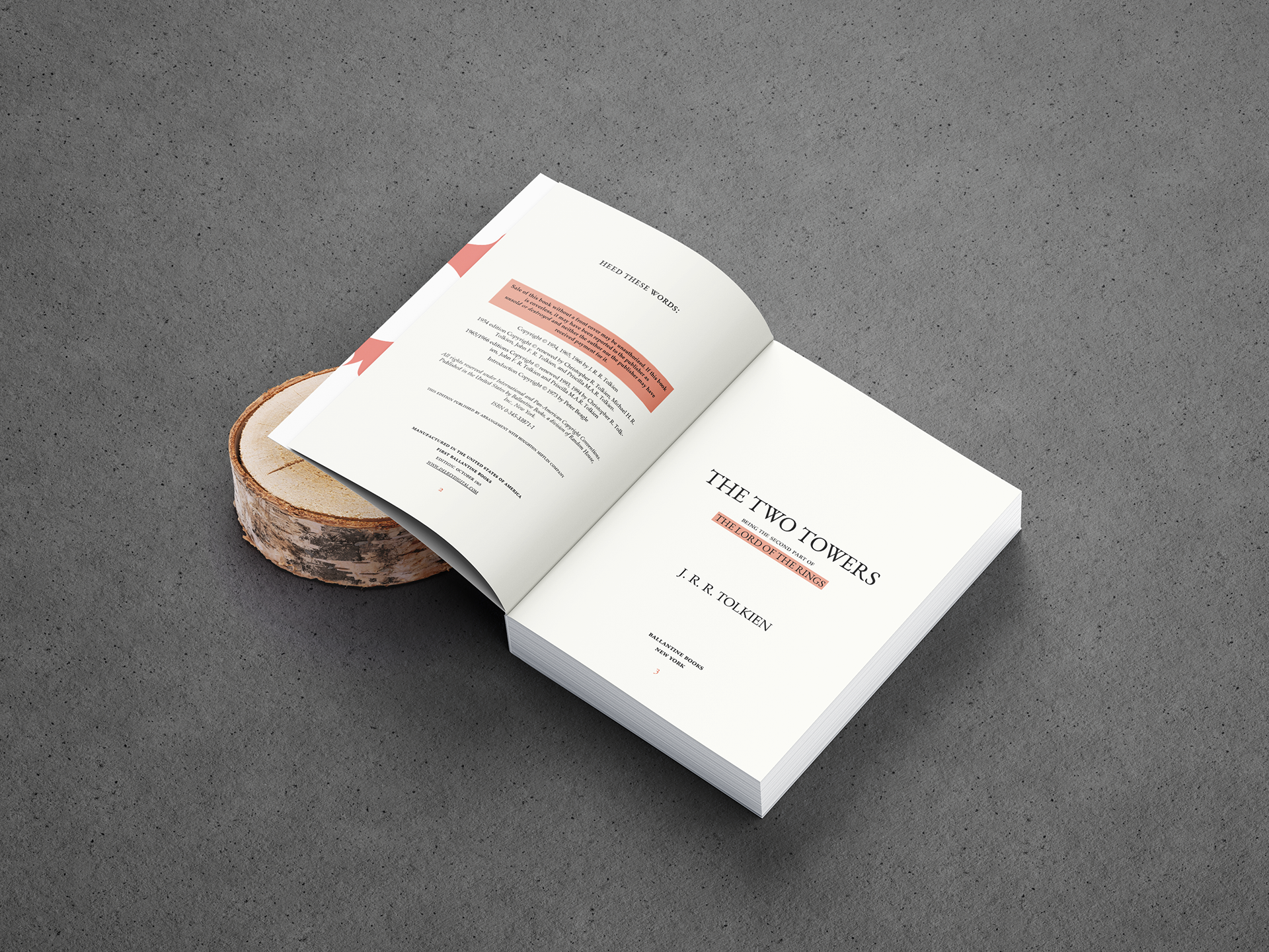
The brief was to breathe new life into an existing book, utilizing typographic skills like typesetting, pairings, and hierarchy to create a new composition. I chose a notoriously wordy series, The Lord of the Rings: The Two Towers, with condense lines and wanted to give the reader more visual space to rest on each page, leading to a more comfortable reading experience for the end user.
Credits
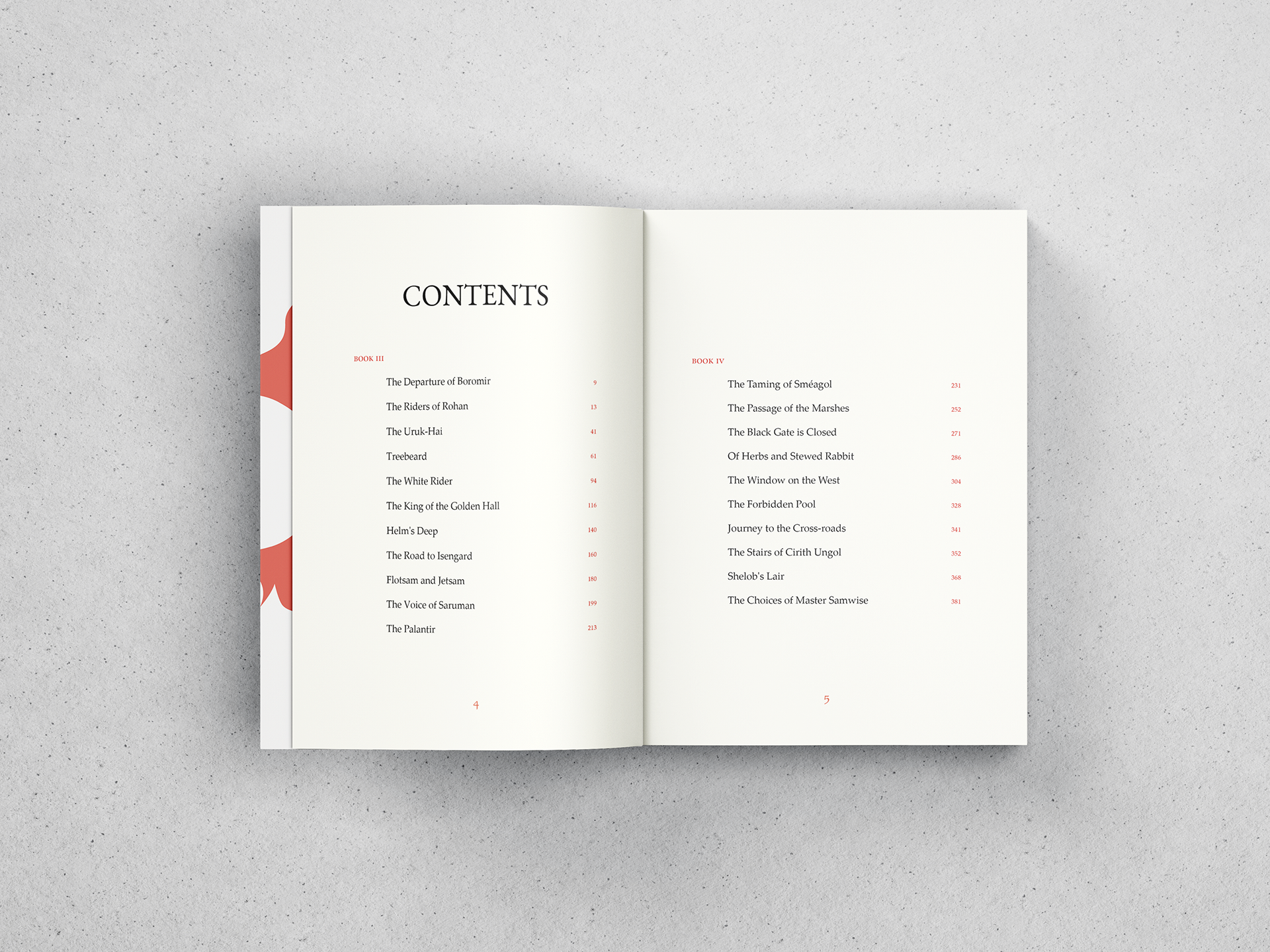
Table of Contents
typography
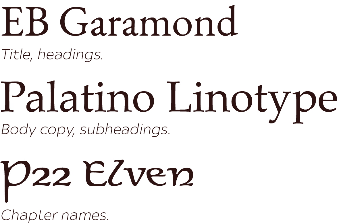
Palatino Linotype was chosen for its line height and easy readability, giving the body cody room to breathe. EB Garamond suited the need of a old text that held many untold secrets, that which The Lord of the Rings contained. P22 Elven was just the right amount of fantasy while not cheapening the classic timelessness of the rest of the page layout.
LORE
2 PAGE SPREAD
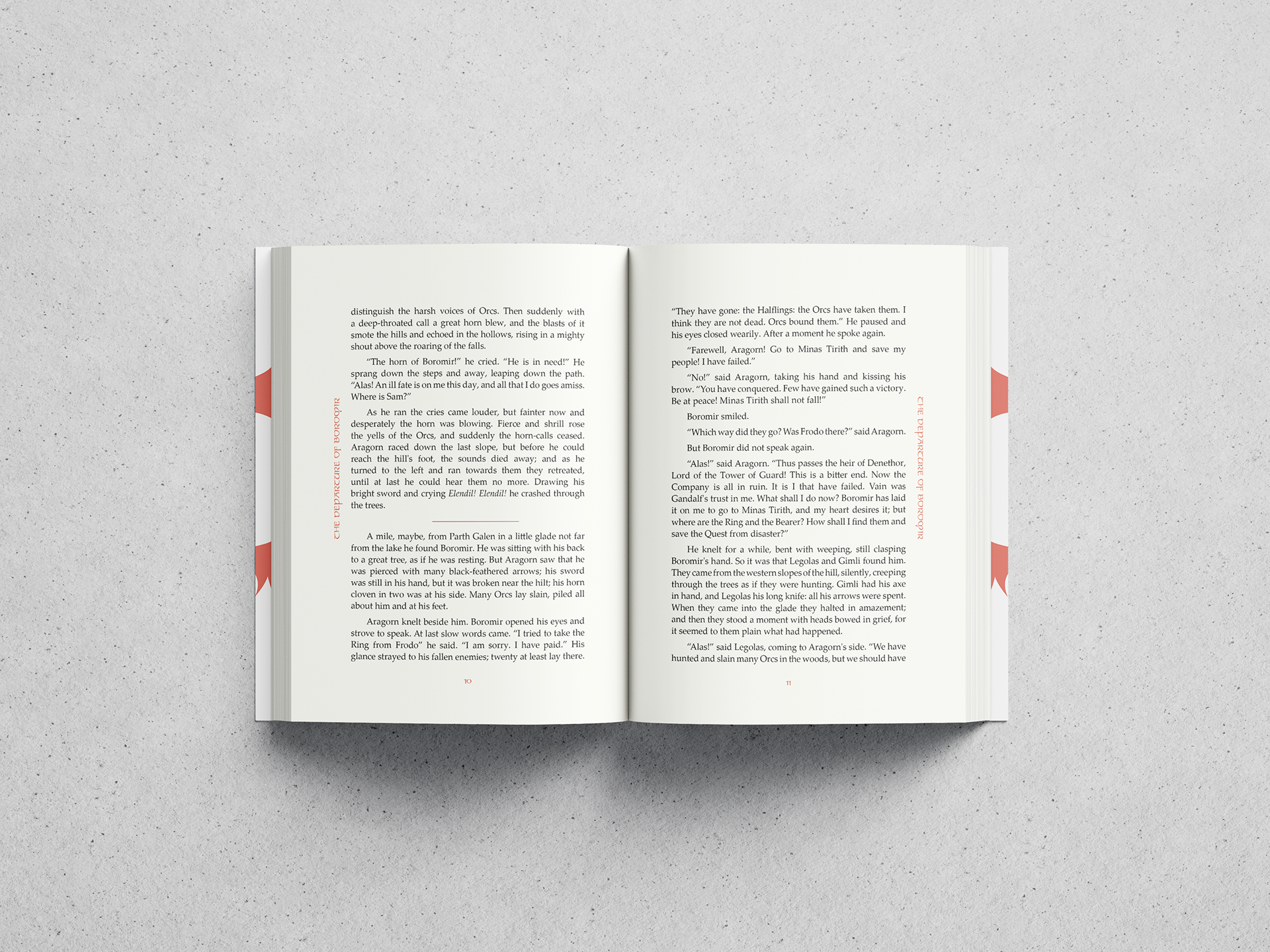
The Lord of the Rings often was designed to get as much of the text on the page, leaving the readers with small, cramped pages. By opening up the leading and designing clear whitespace in the margins, the reader can read at a quicker pace.
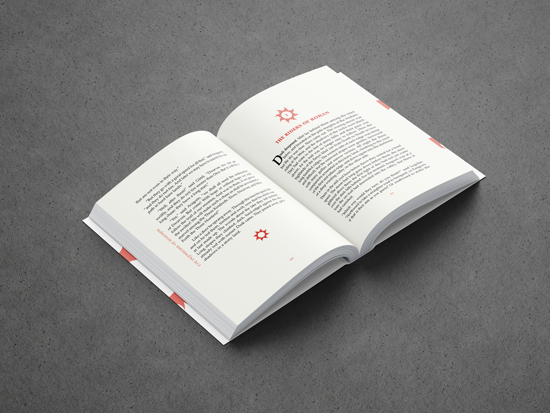
Moving chapter titles to a vertical placement takes up less real estate on the page, letting the chapter's text take center stage.
2 Page Spread
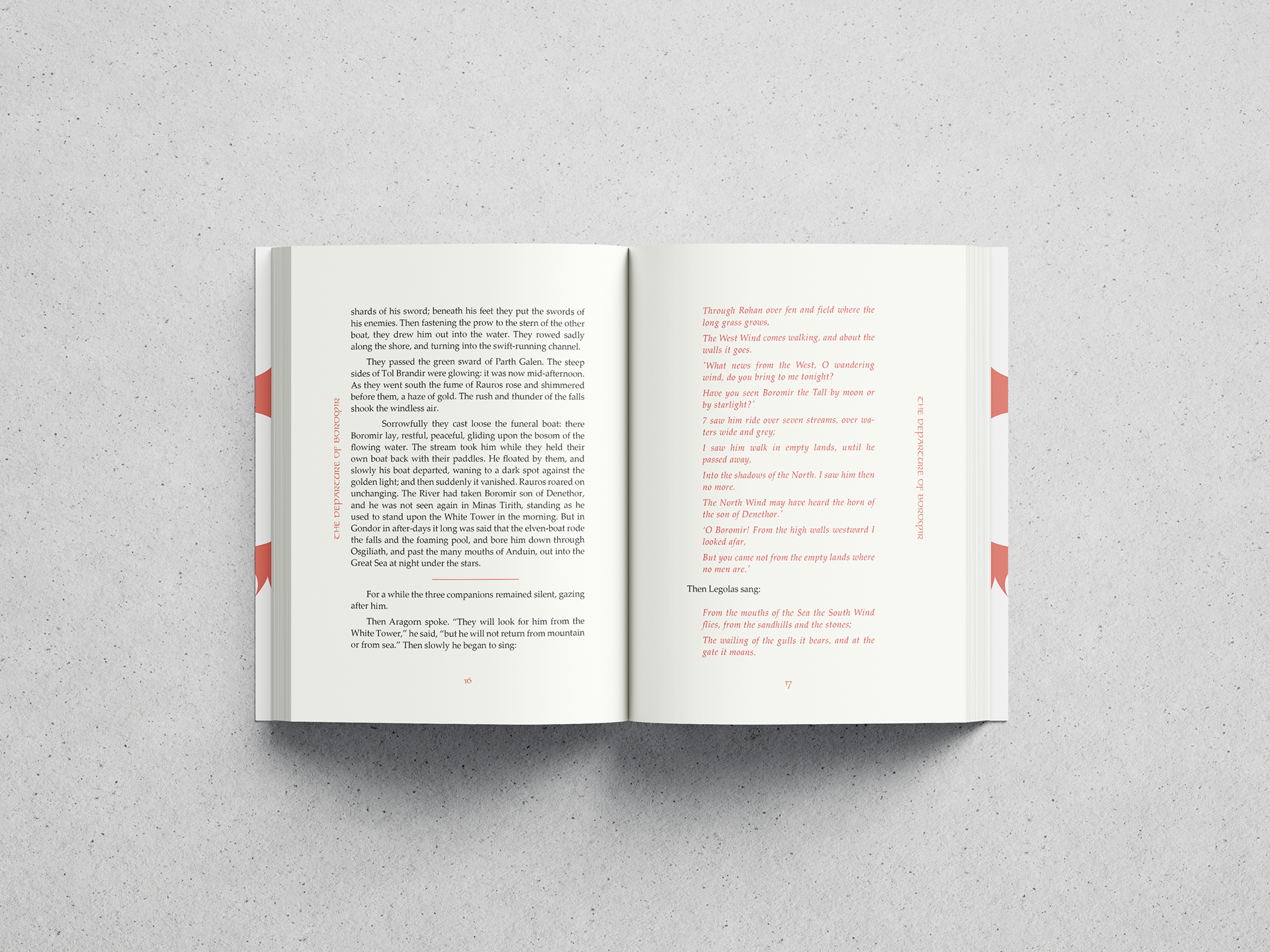
Something prevalent throughout Tolkien's work is the use of song within the text. Several readers I spoke to when designing often talked about how there would be pages of song, and you wouldnt quite know where it started or ended at a glance.
Tackling this visually, I utilized the red accent color and different paragraph styling to make it immediately apparent when characters were singing, helping readers throughout their experience.
Chapter End & Chapter Beginning
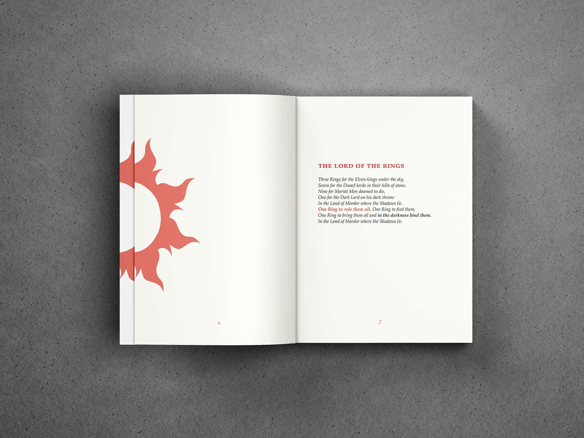
The imagery of a red crown of flames is used throughout this book's design. It represents the flaming eye of Sauron, as shown on the cover. Sauron's gaze and trying to avoid it is the cause of many of the Fellowship's troubles throughout the series, and Saruman's tower is just as relevant in the events of the book.
Representing these both visually through clean vector graphics is showcased throughout the chapter design, as well as the beginning and end inner pages.

If our work ethic aligns and you’d like to curate digital
solutions to your modern problems, let’s connect!
solutions to your modern problems, let’s connect!