clean beauty made with care.

who are we?
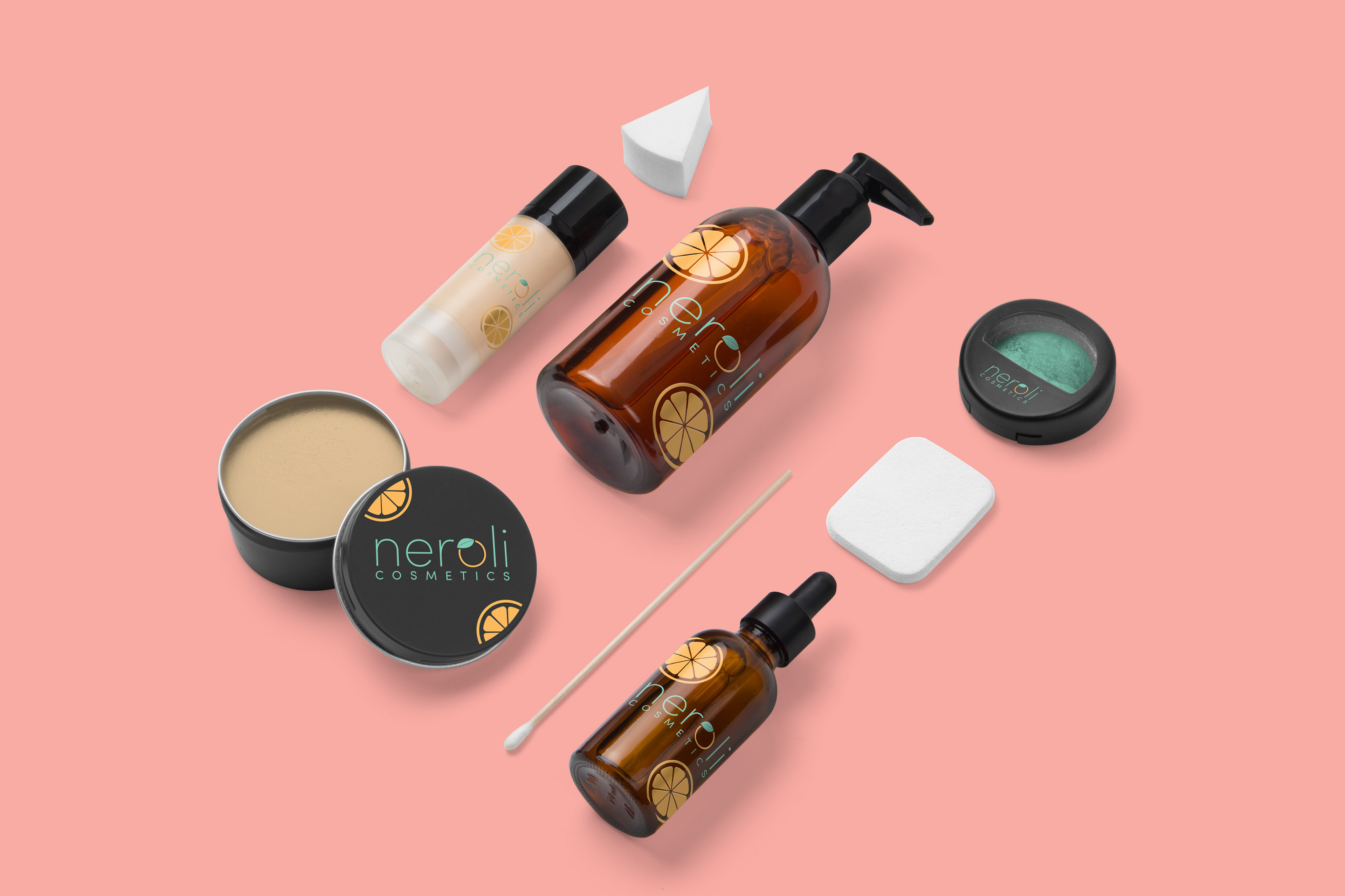
Neroli Cosmetics is a Central Florida based beauty and lifestyle company whose main focus is the use of local produce in their products.
Three years ago, founder Julia Khan’s son had a severe allergic reaction to a drugstore body wash, and this very event led to the establishment of Neroli Cosmetics.
Having a product with ingredients buyers can understand, recognize, and trust is key. Every item that comes out of the Neroli Cosmetics line is researched and tested thoroughly, so that buyers know exactly what they’re putting onto their body.
Julia knows just how important trust in a company can be, so she wants to create a website and brand that her customers can build a deeper connection with.
In 2017, Neroli Cosmetics partnered up with The Ronald McDonald House and raised $20,000 for charity, in honor of her son. They hope to raise even more in the future with this expansion to the web.

project brief
branding and Marketing Goals
With this new website build we hope to expand accessibility and visibility by opening our company up to a new platform.
By doing so we also will meet another goal, which is to raise more money for the Ronald McDonald House in 2019.
We here at Neroli Cosmetics also aim to foster a relationship between customer and our product by creating a brand image and presence. Throughout all of this, it is of the utmost importance to keep our ethics on the forefront:
Keeping products and ingredients transparent, understandable, and reliable.
Project Overview
Create a brand/”look” for Neroli that customers can recognize and associate with us, therefore building trust in the brand.
Clean and simple
New labels on products
project parts
Create a website
Accessible
Understandable
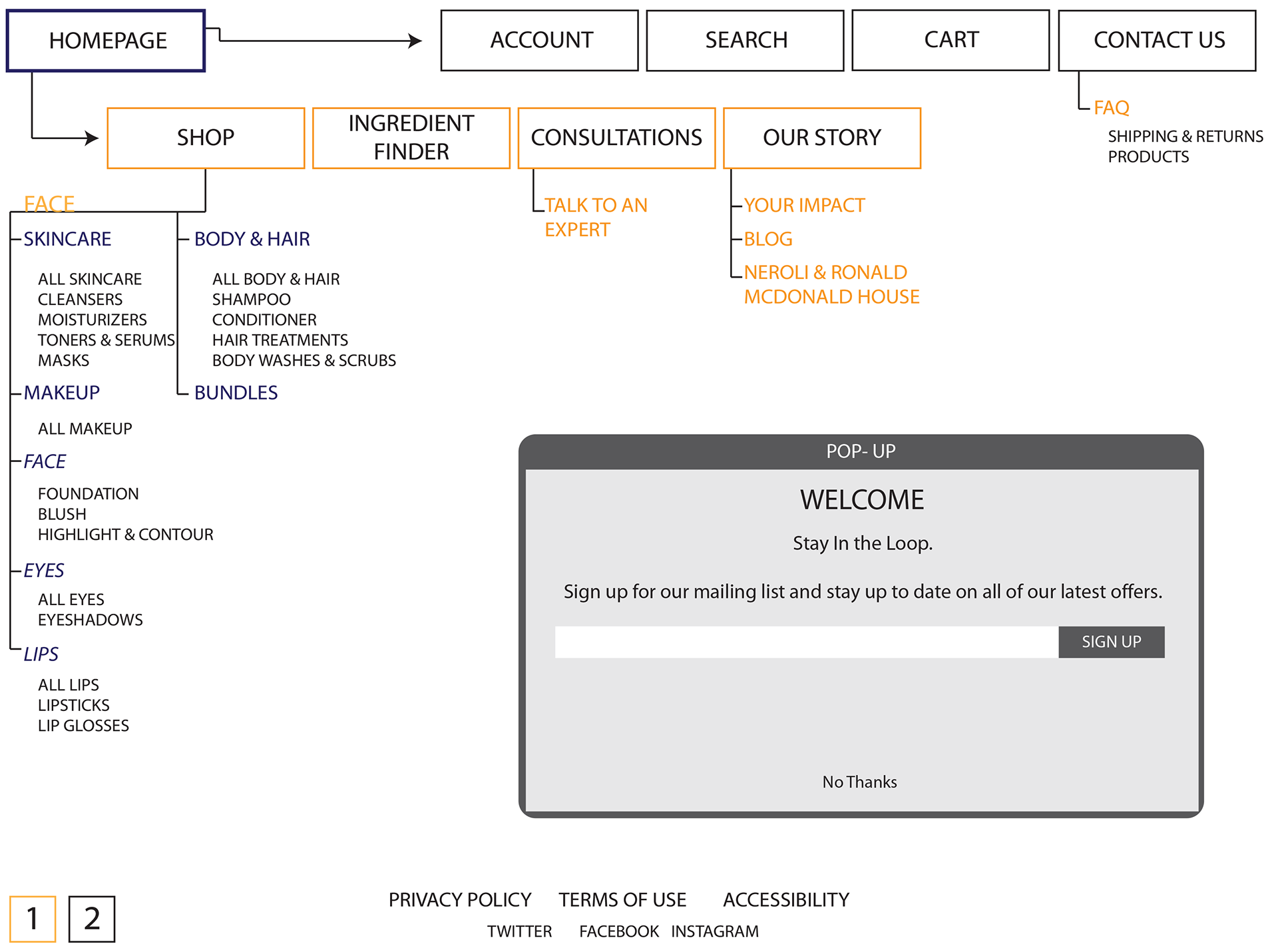
Sections
About us (origins and charity work)
Products (hair, face, body, makeup)
Bundles
Contact us
Review capabilities
Shipping options
web advertising
3 ads
5 per group
target market
80%
FEMALE
FEMALE
50%
20-40
20-40
40%
<$20,000
<$20,000
60%
MARRIED
MARRIED
70%
BACHELOR’S
BACHELOR’S
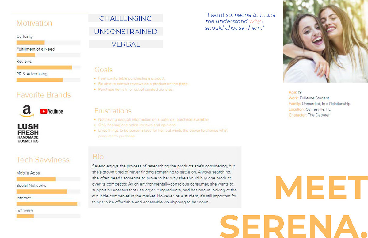
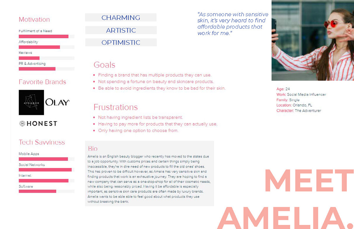
personas
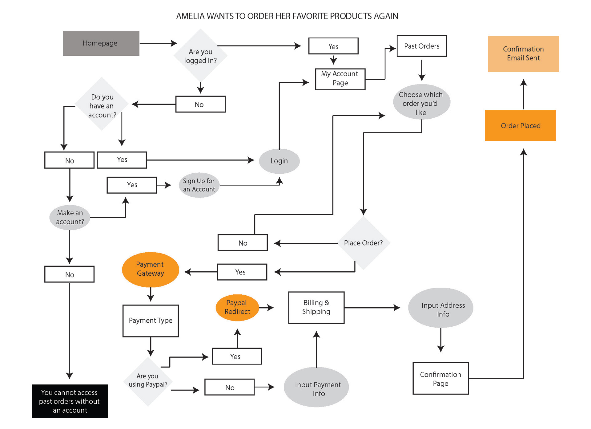
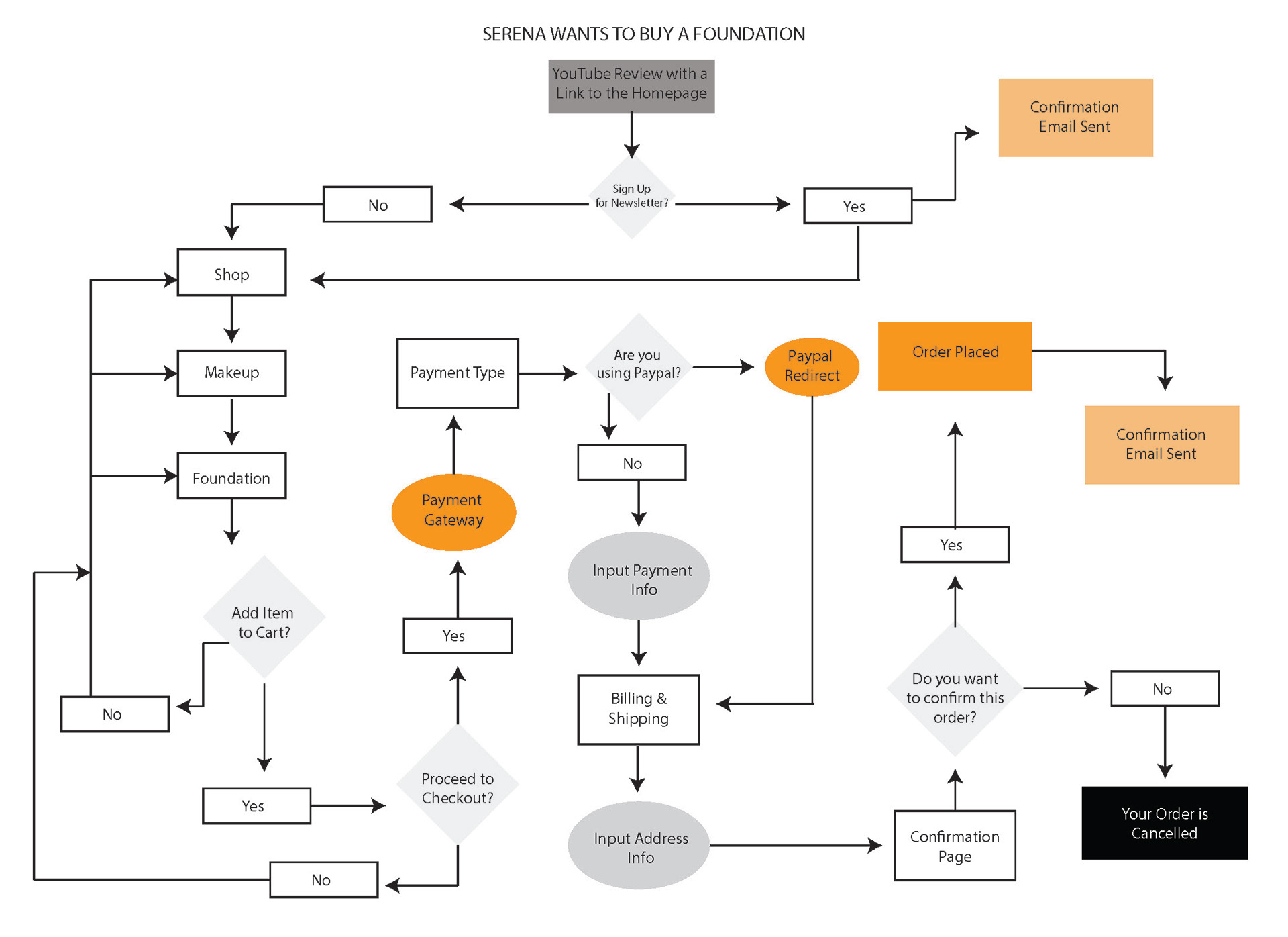
process flow
sitemap
typography
heading
Montserrat Regular 30pt
Montserrat Regular 30pt
subheading
Montserrat Regular 12pt
Montserrat Regular 12pt
body
Open Sans
Open Sans
wireframes
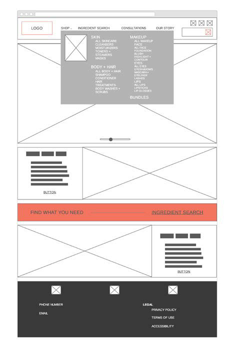
Homepage
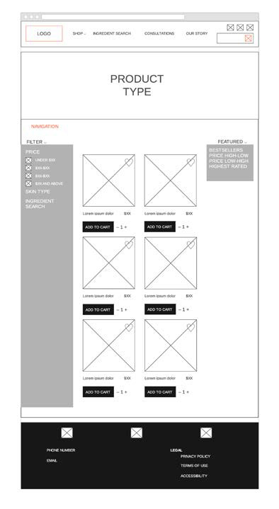
All Products
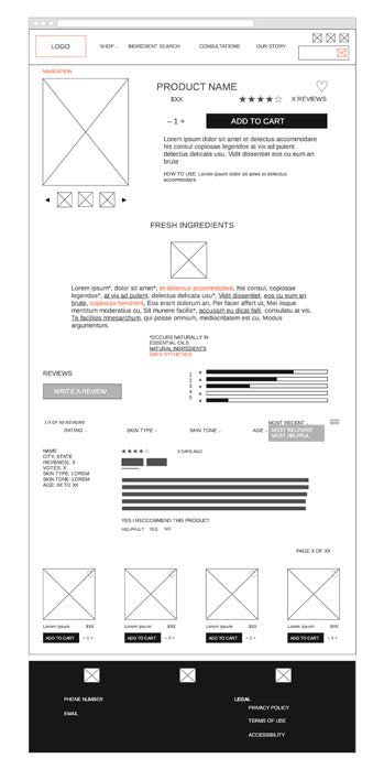
Product Page
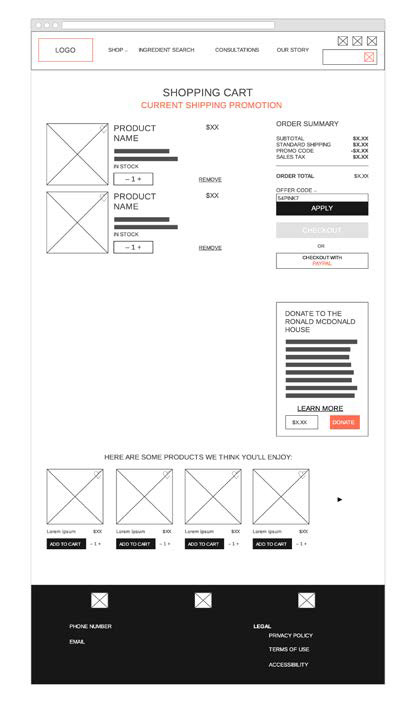
Cart
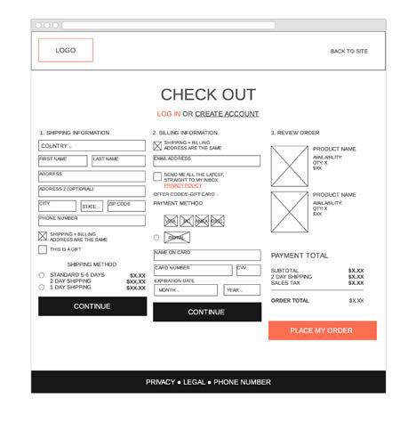
Checkout
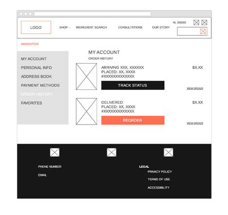
Account Orders
web comps
Homepage
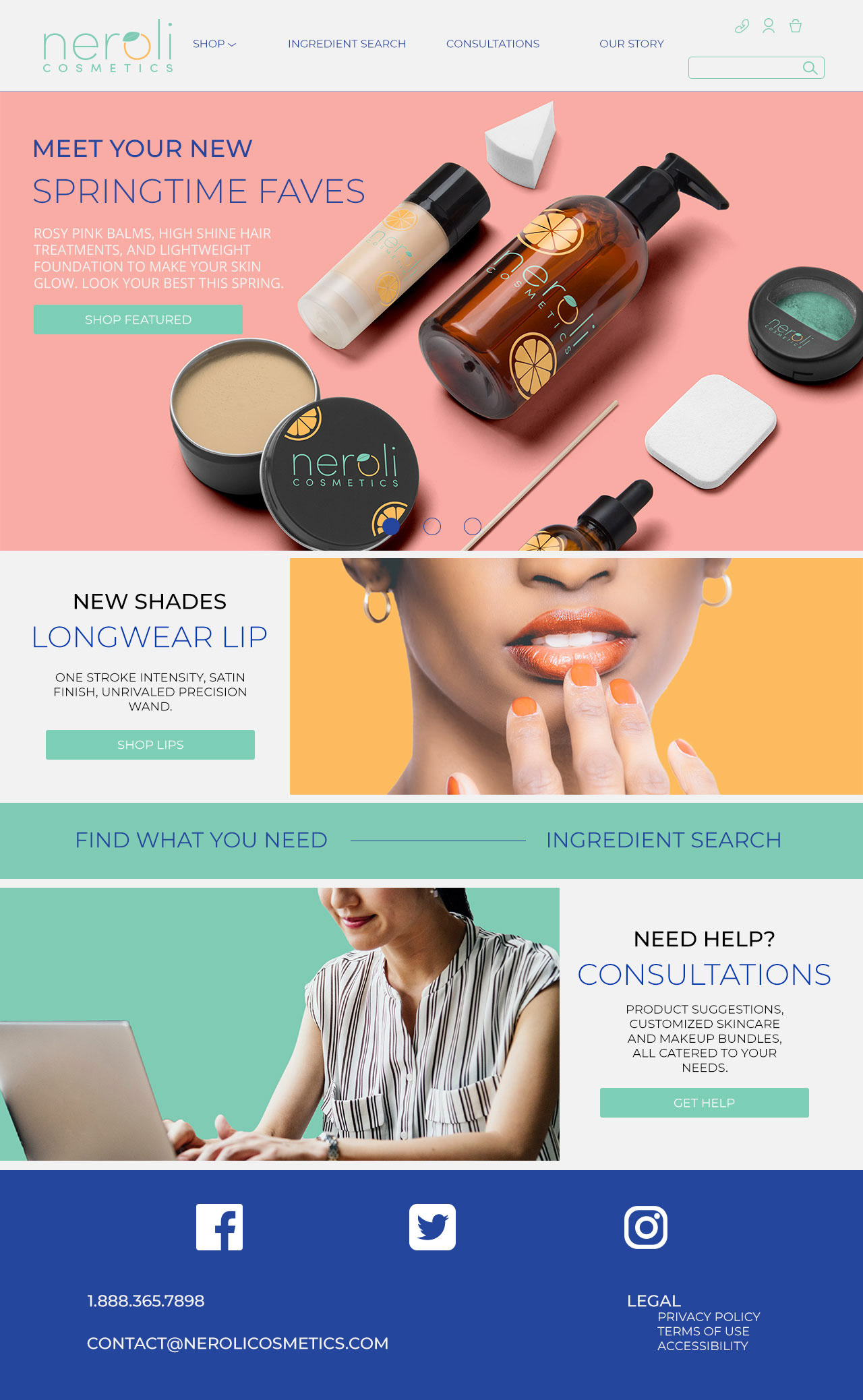
Slider 1
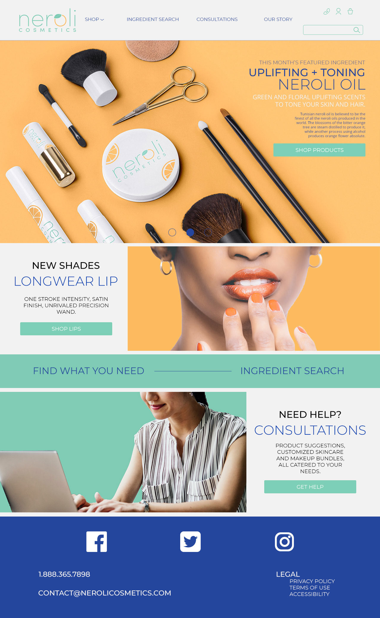
Slider 2
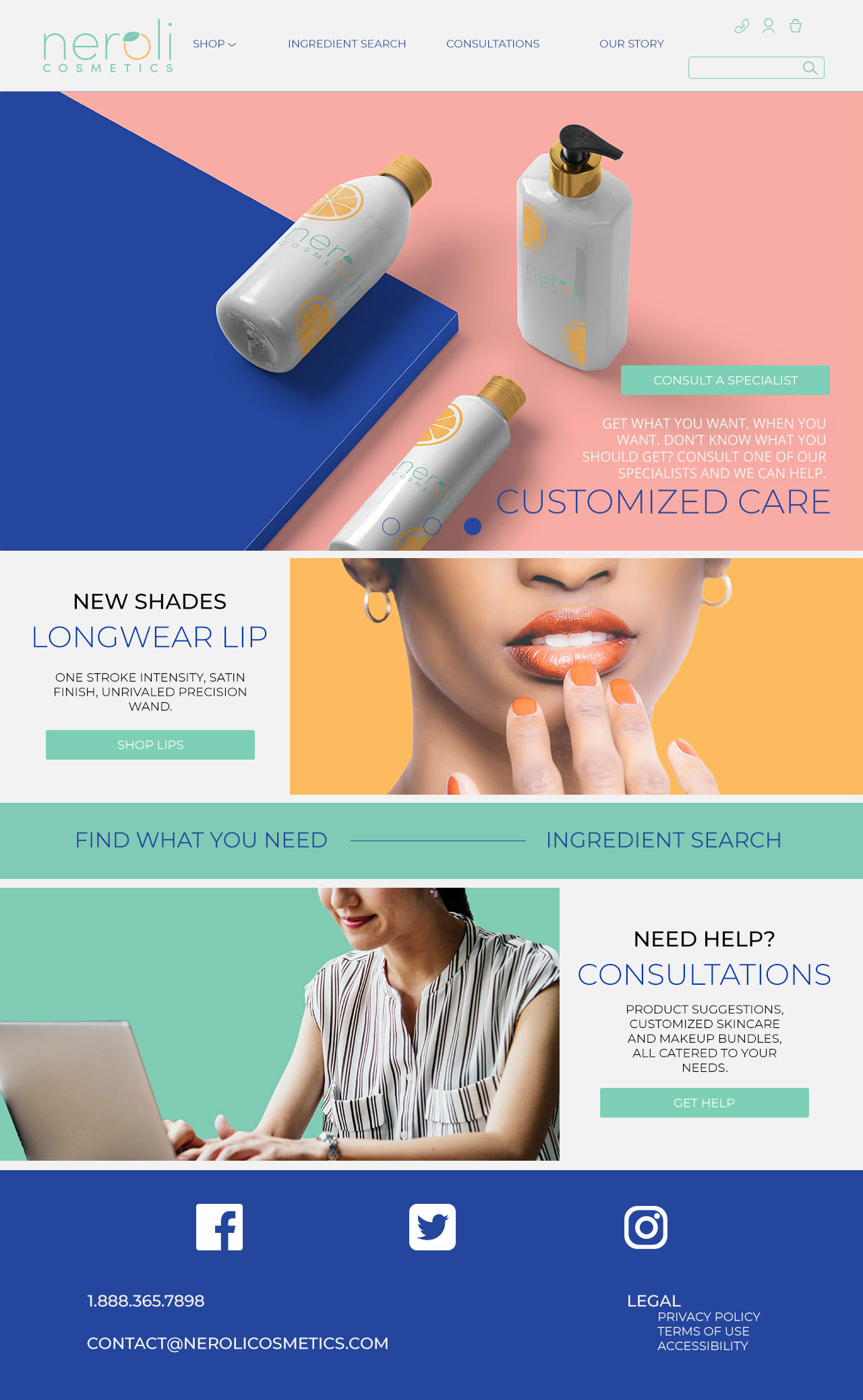
Slider 3
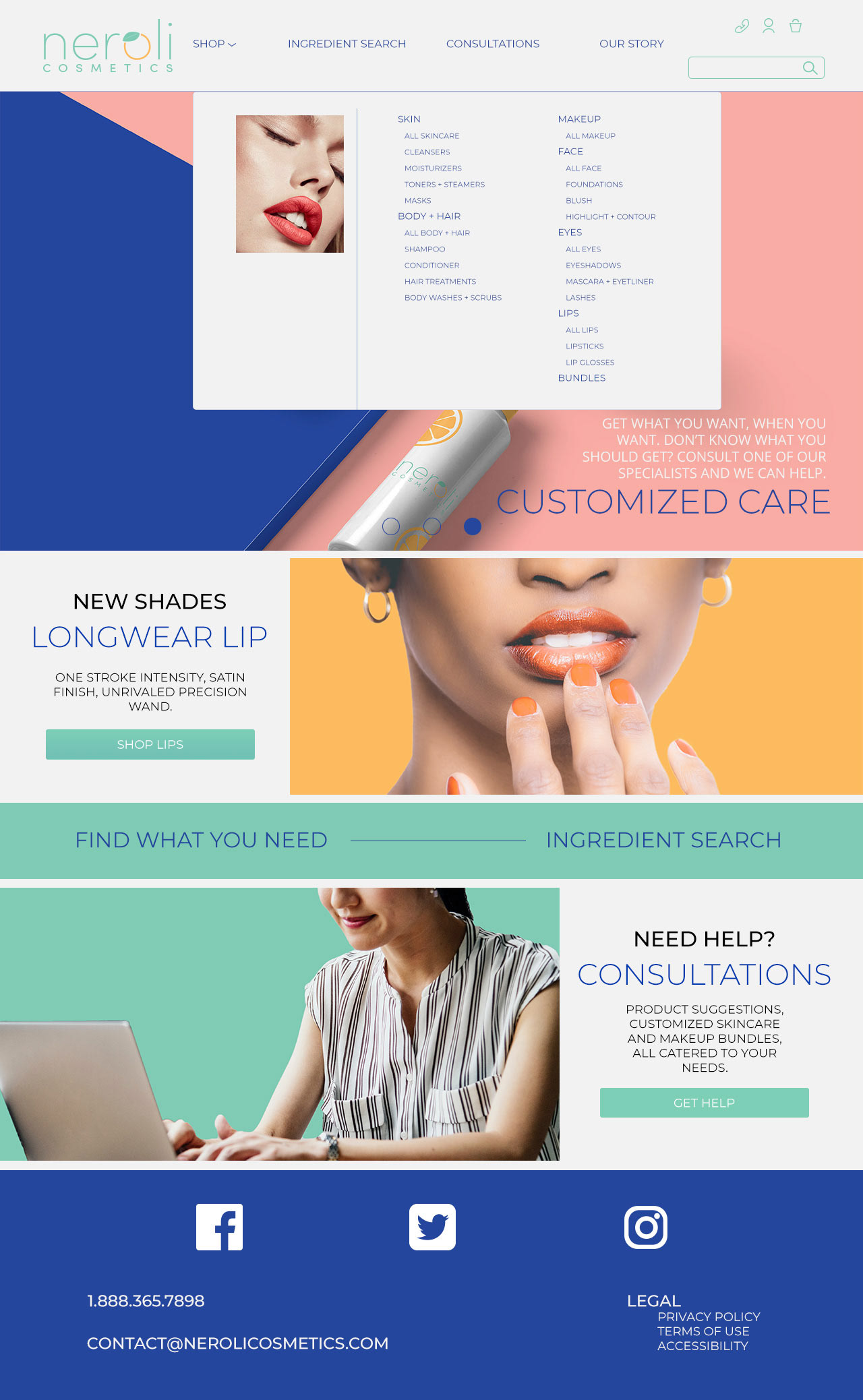
Navigation Hover
KEEPing THINGS SIMPLE.
products page (all)
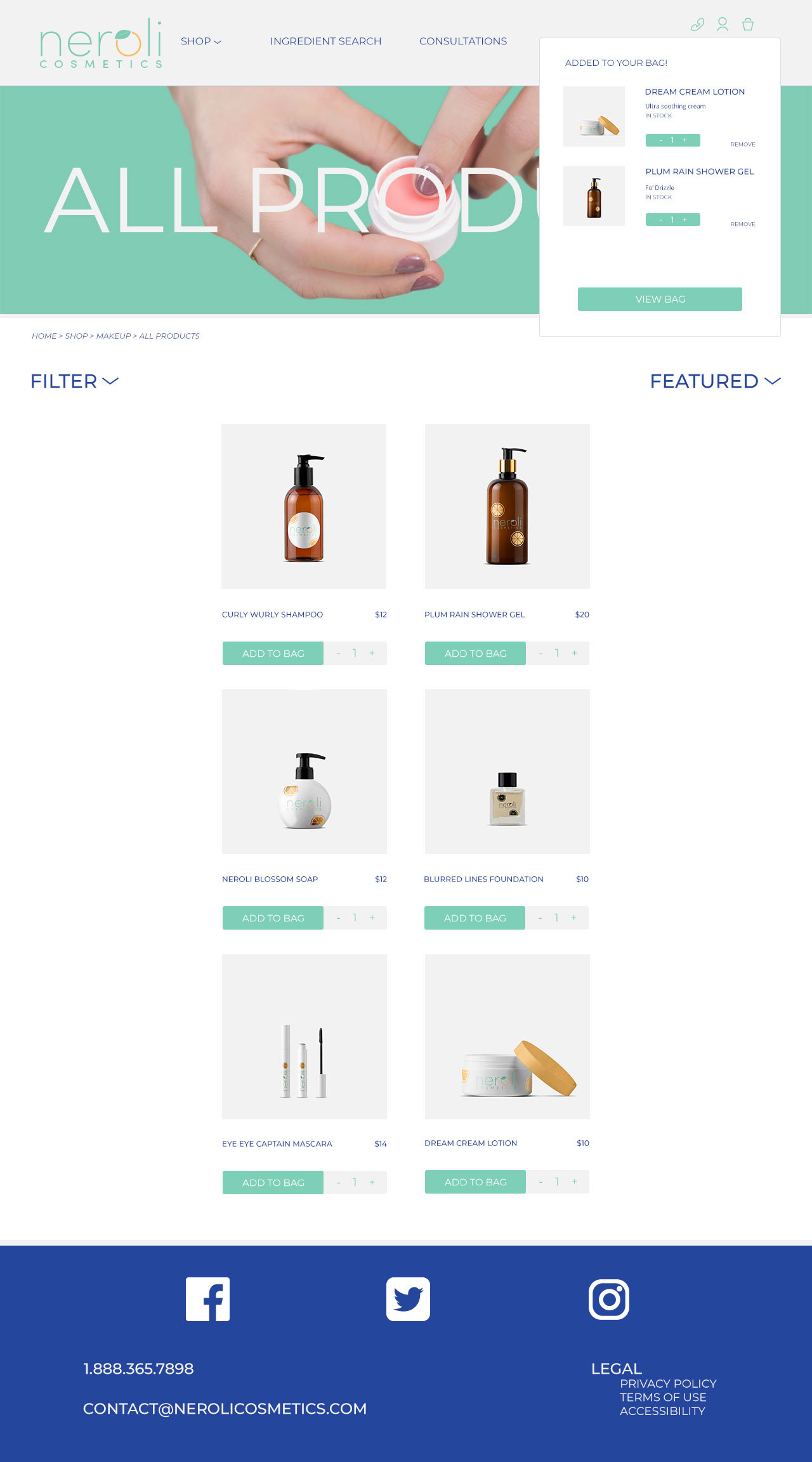
Cart Pop-up
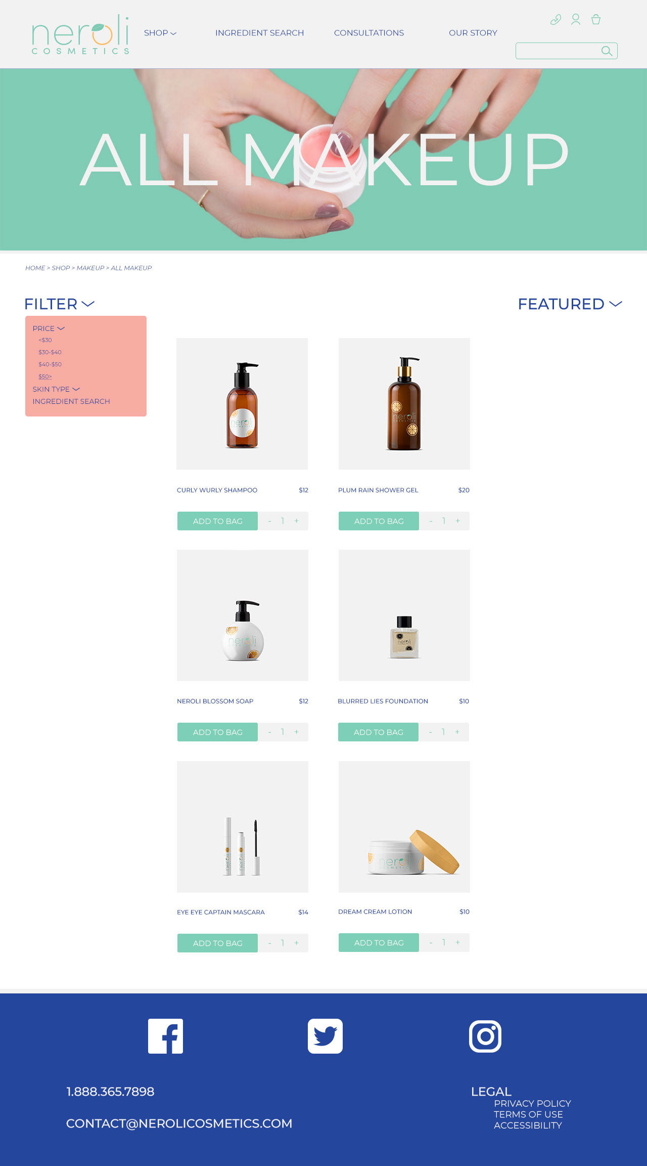
Filter Dropdown
Here, the layout is clean and open, allowing the viewer's eye to travel through the page. Bright pops of color direct them to important elements.
LET THE PRODUCT SHINE.
Product page
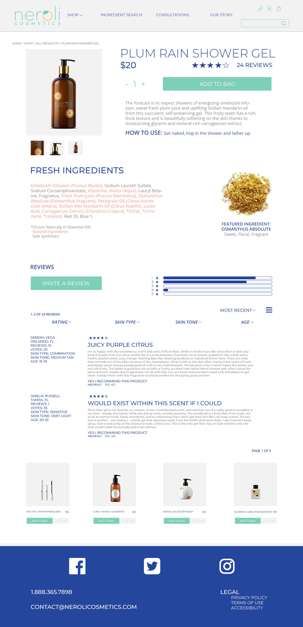
Review Filter Dropdown
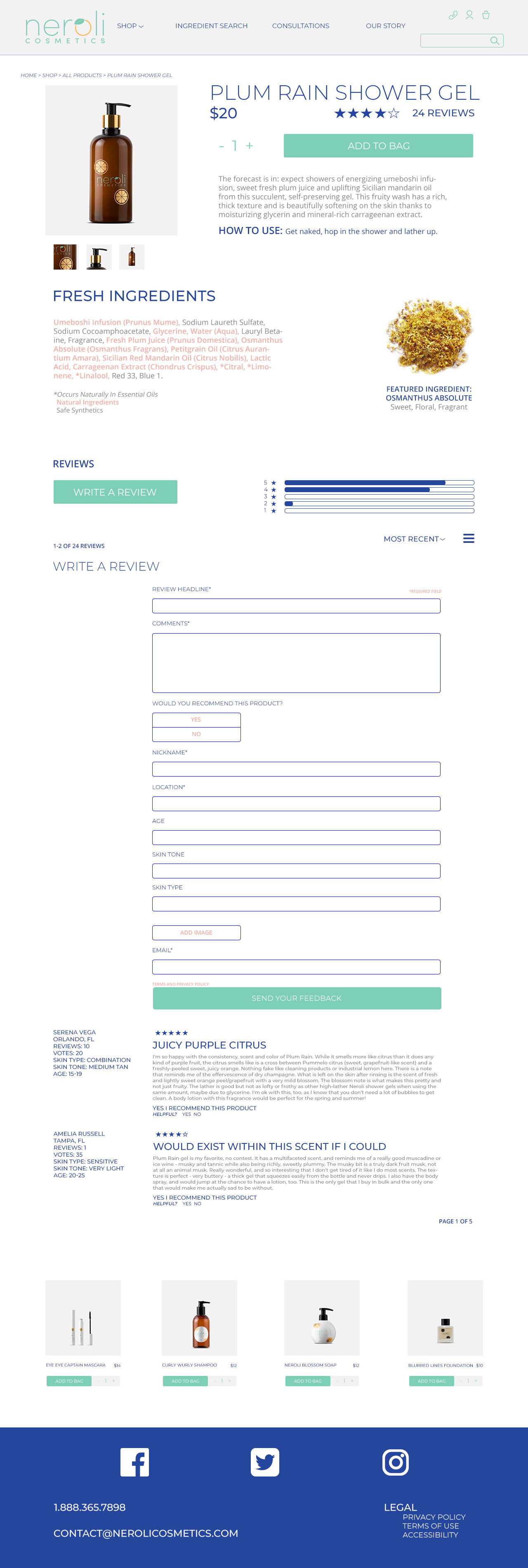
Review Form
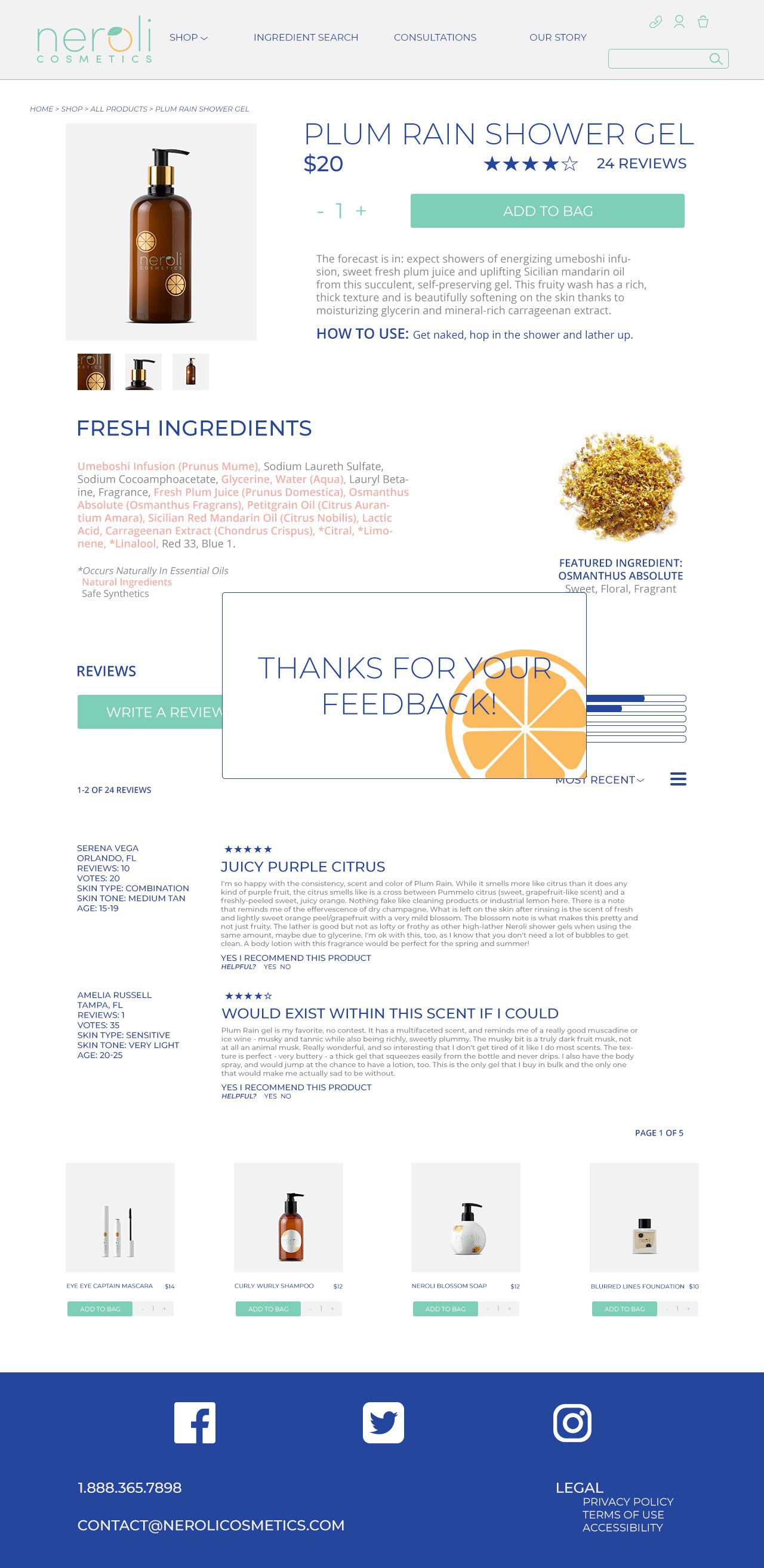
Submission Pop-up
The product detail pages will always have a lot of information, due to the ingredient list and reviews, but by keeping the colors minimal, the design isn’t distracting from the main event: the product itself.
CONSISTENCY IS KEY.
Cart
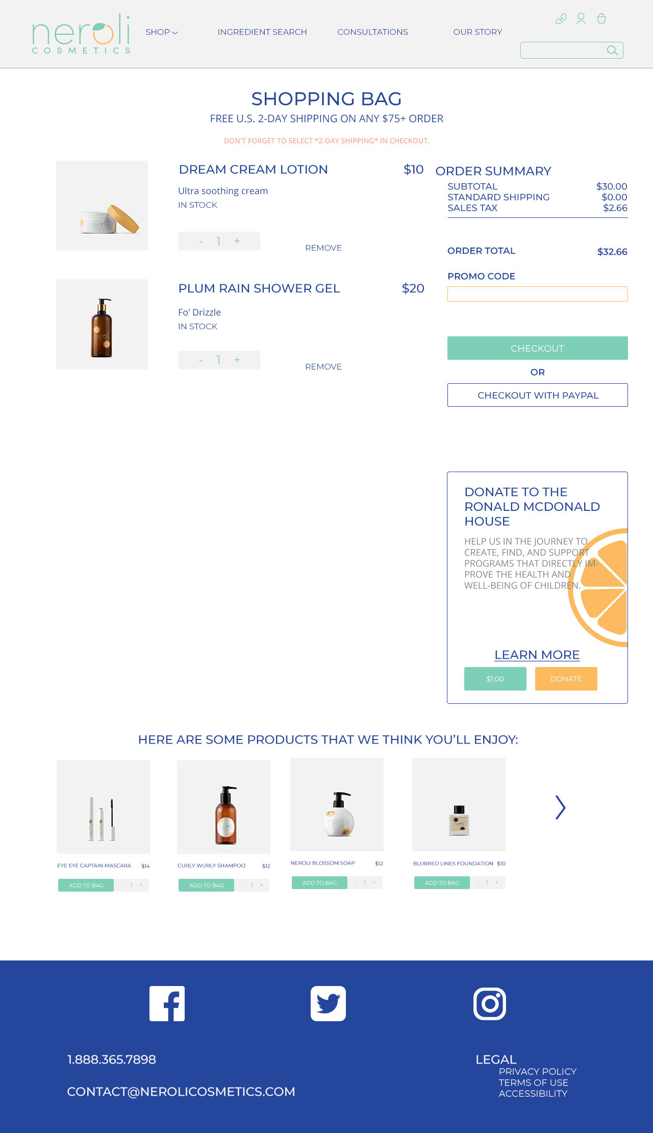
2 Product Cart
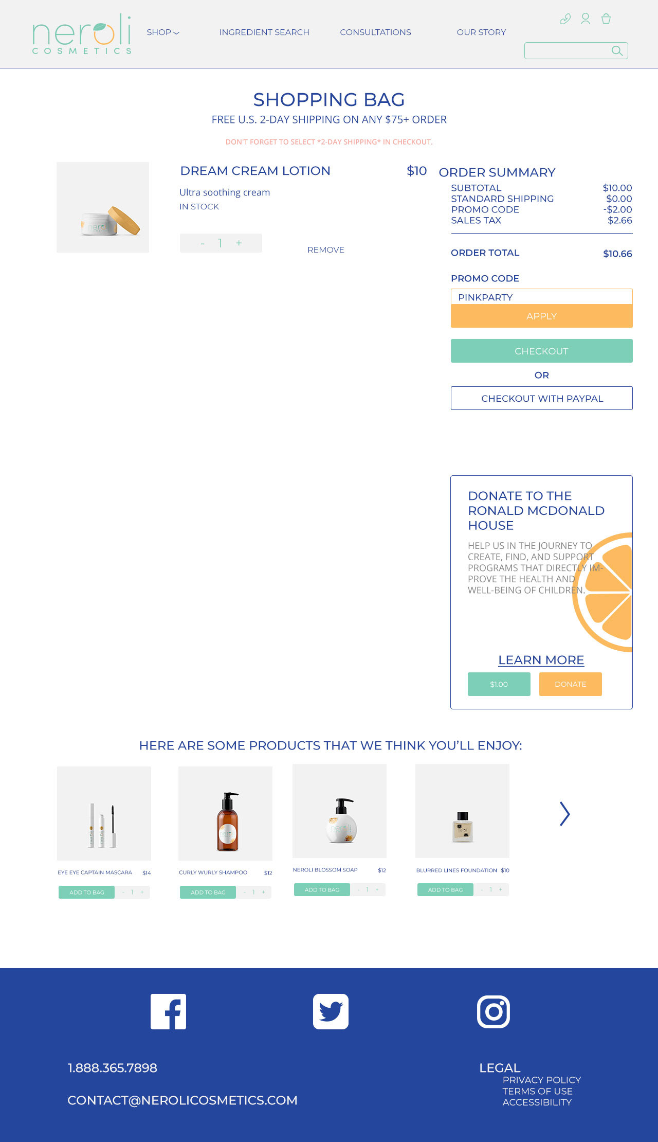
1 Product & Promo Code
By using the same basic configuration of the products, the page is able to fall into place around them, keeping a streamlined and stable design. Again, bright colors help guide the viewer’s eye.
IT STARTS WITH WHITESPACE.
checkout
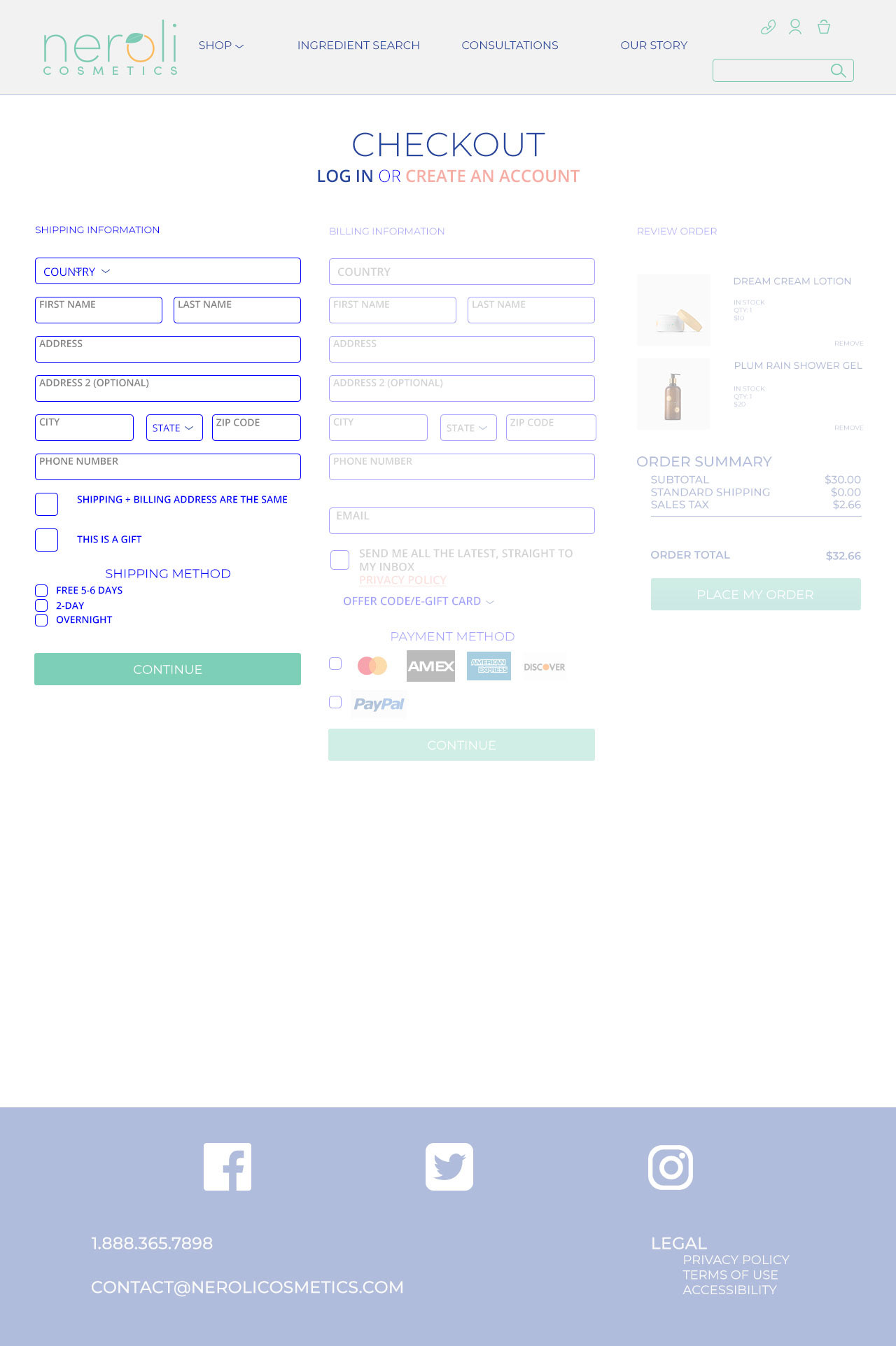
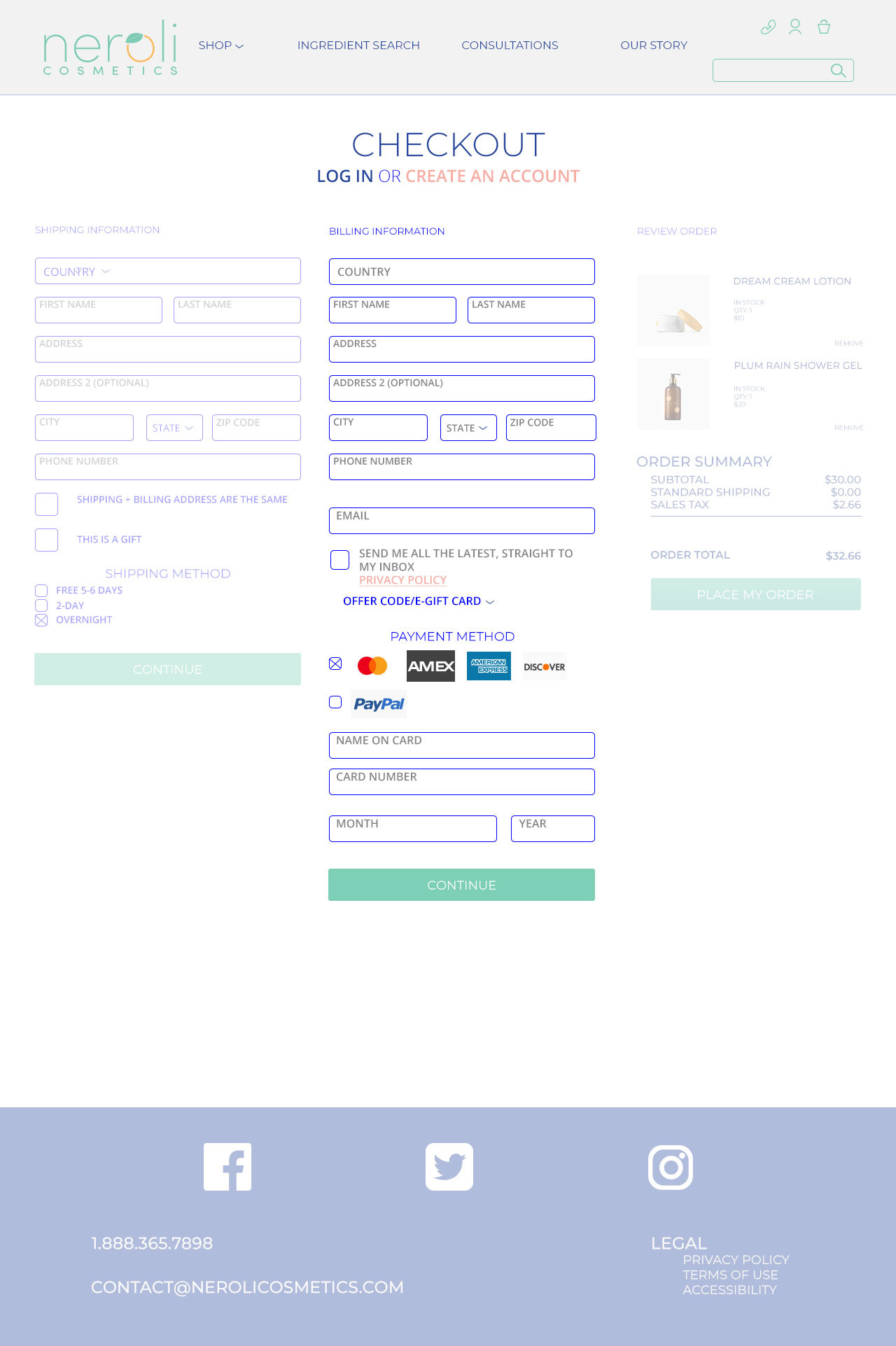
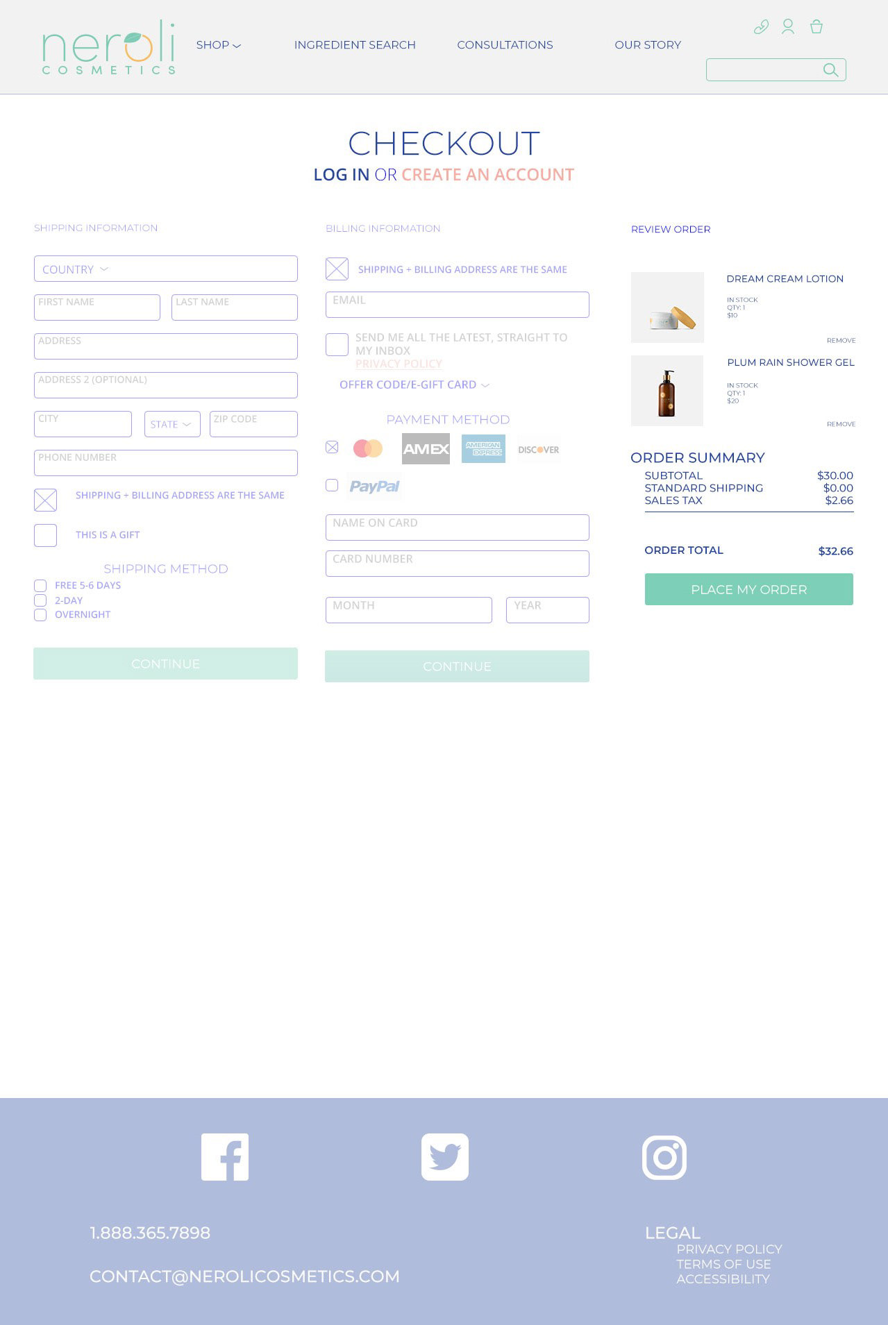
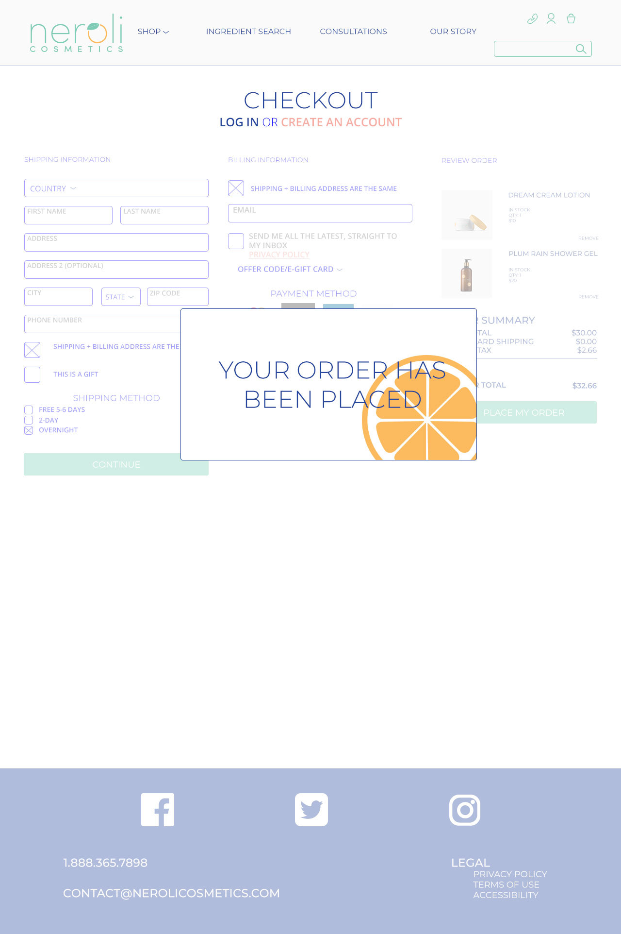
It was tricky to make such a busy page easy for the user. However, by keeping colors minimal, the user can focus on the task at hand, moving through the checkout process easily.
KEEPING THINGS PERSONAL.
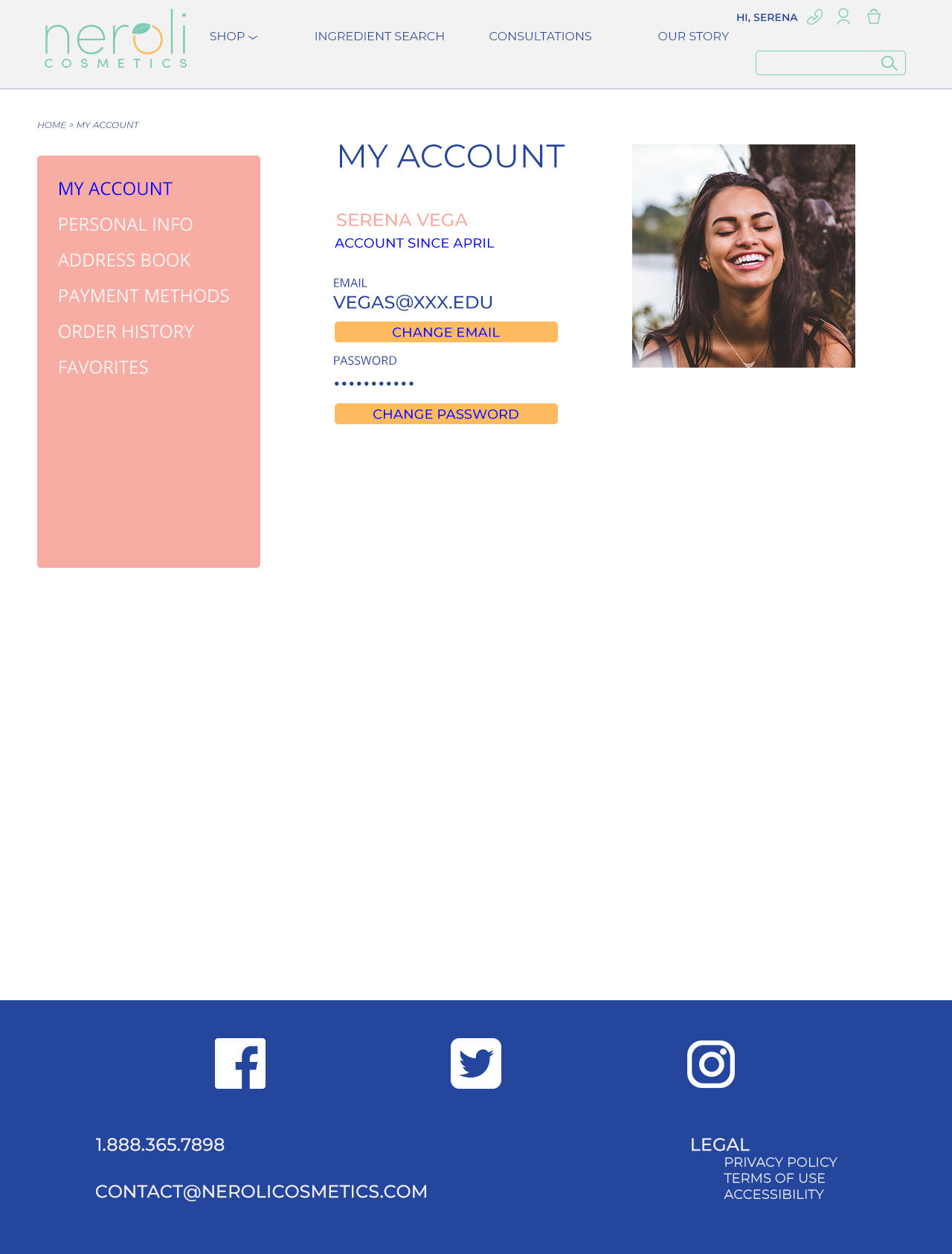
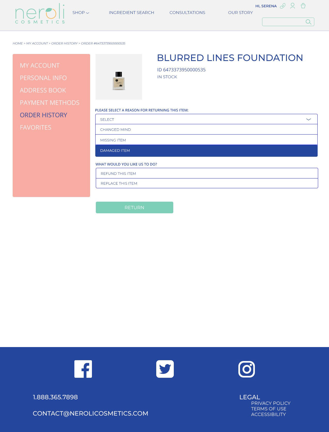
account
Account Home
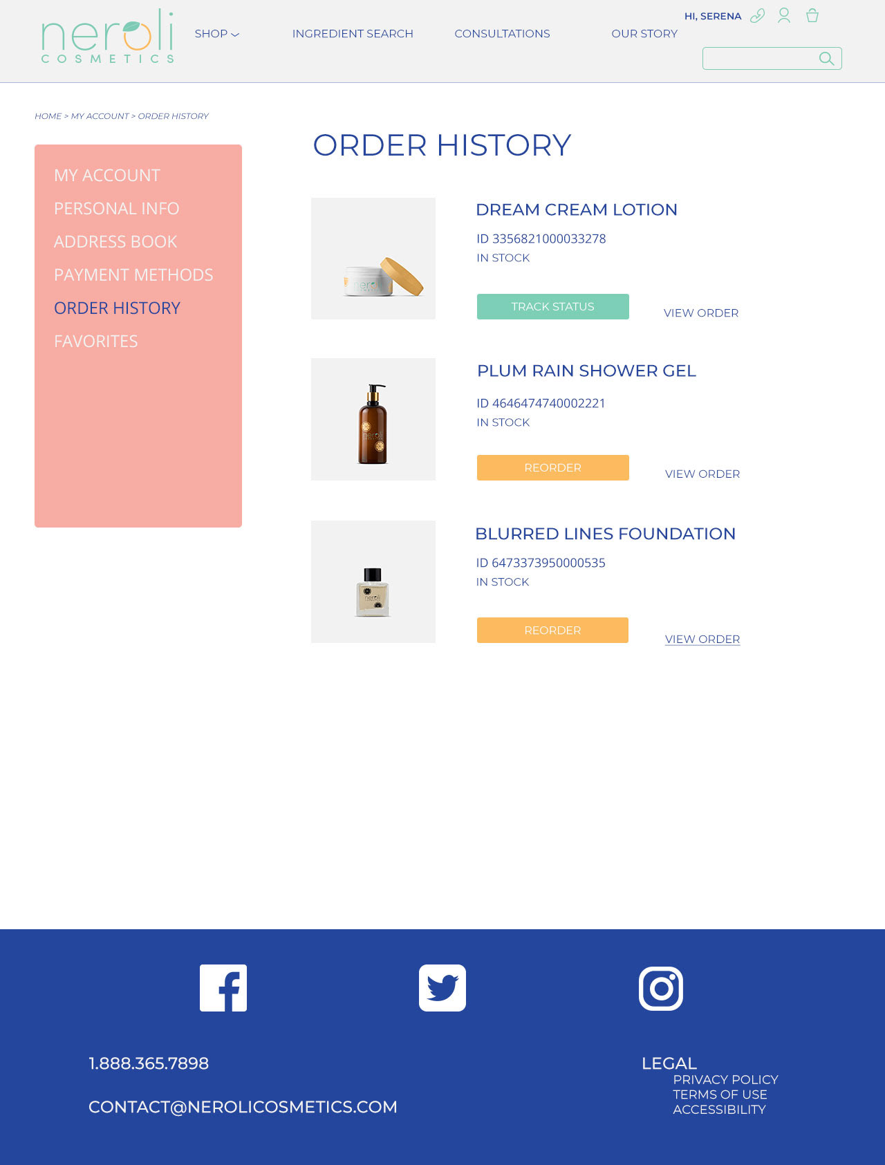
Order History
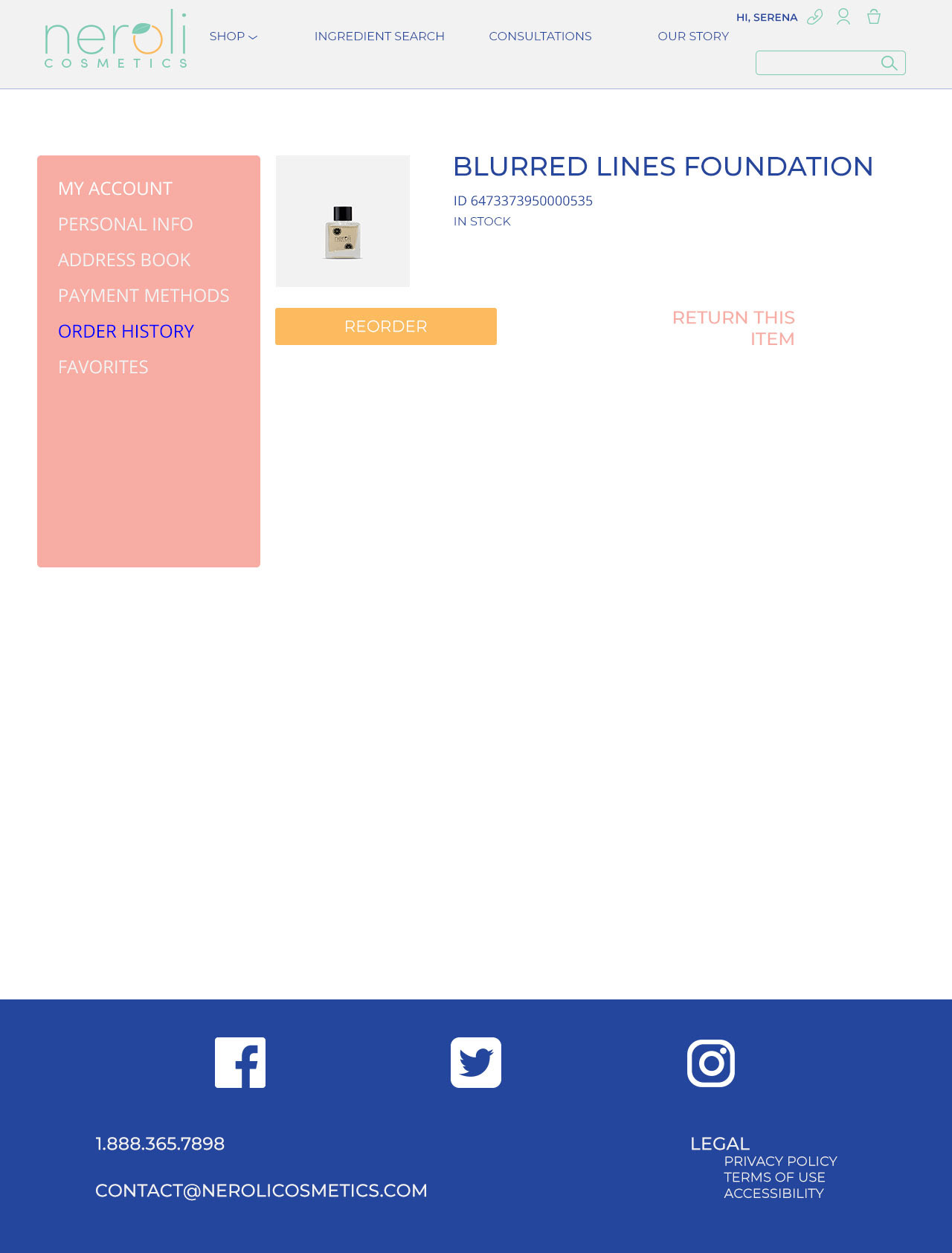
Order Item Page
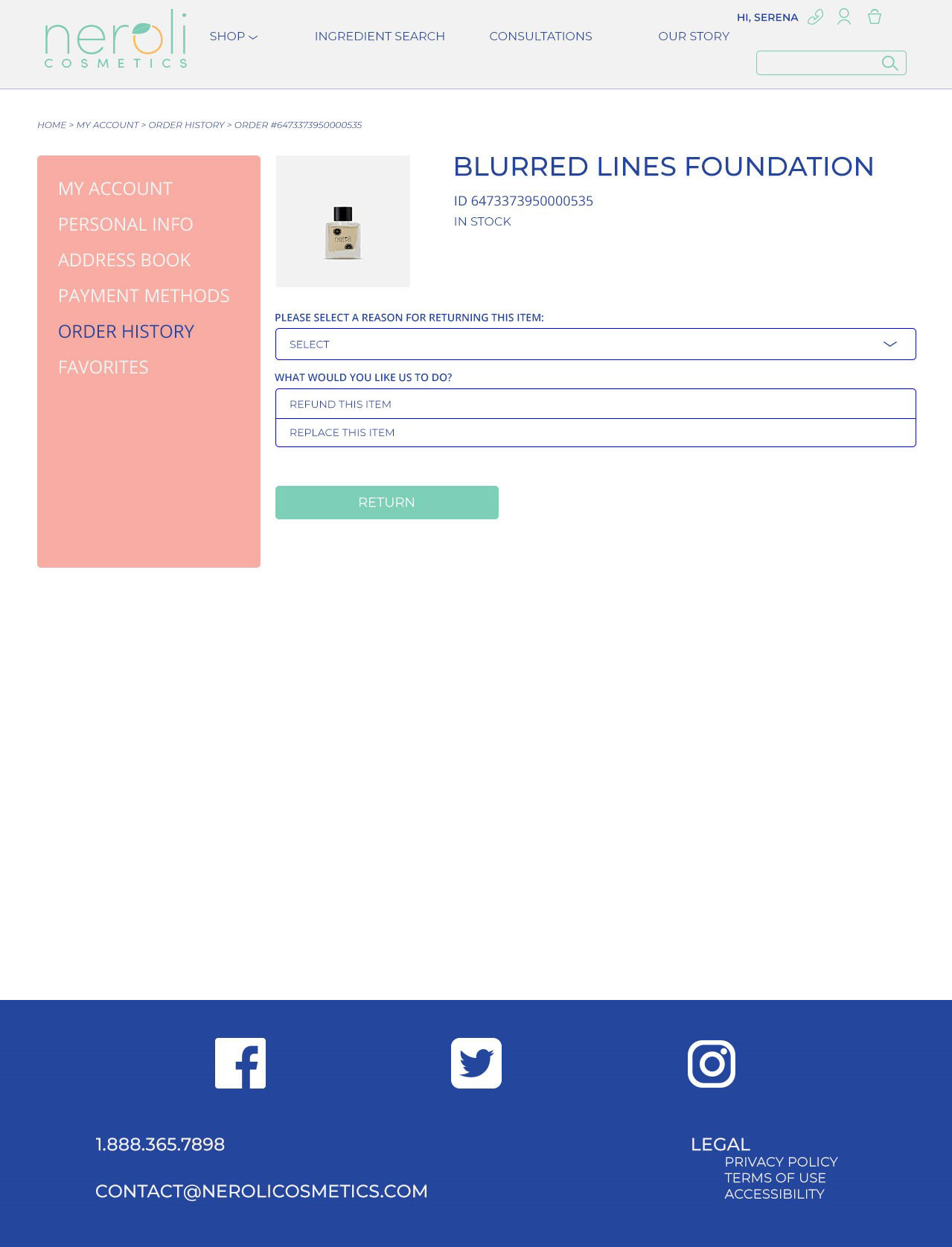
Return or Replace Item
Reason for Return or Replace
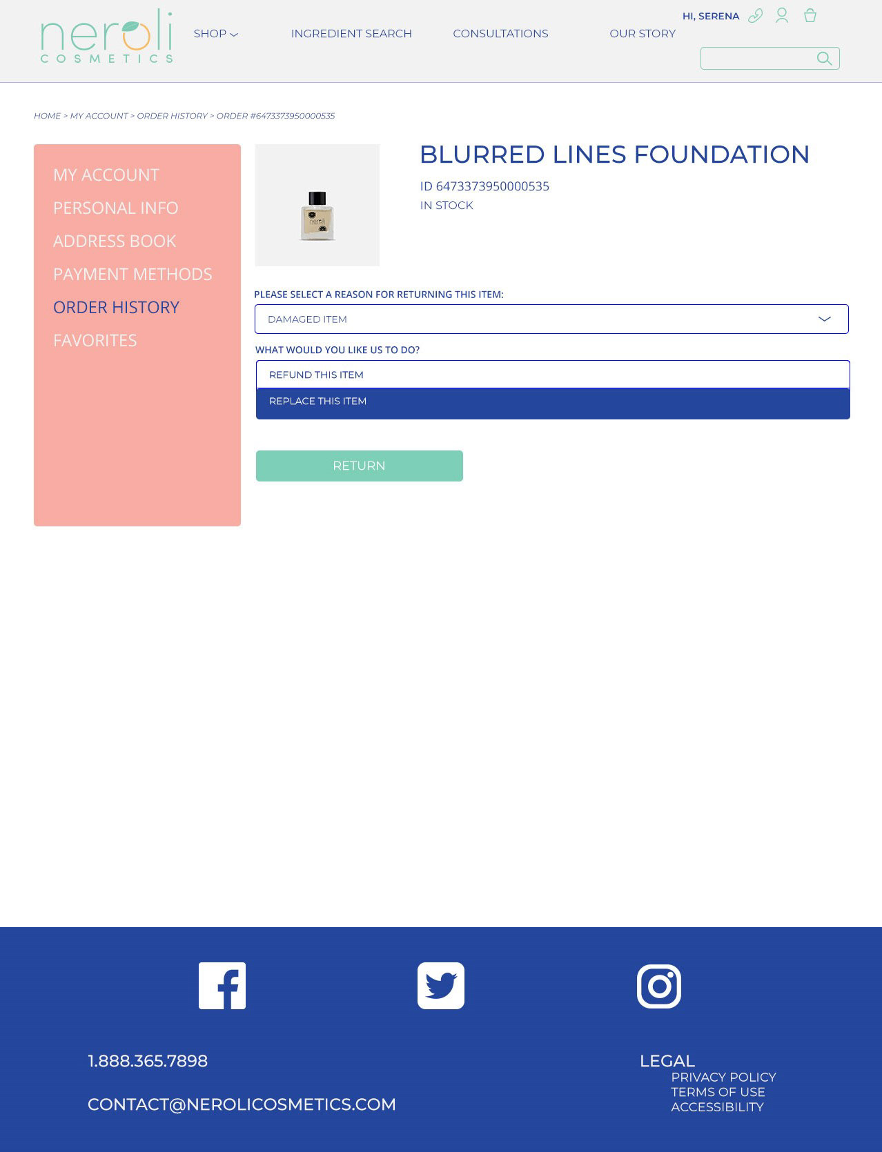
Return or Replace Dropdown
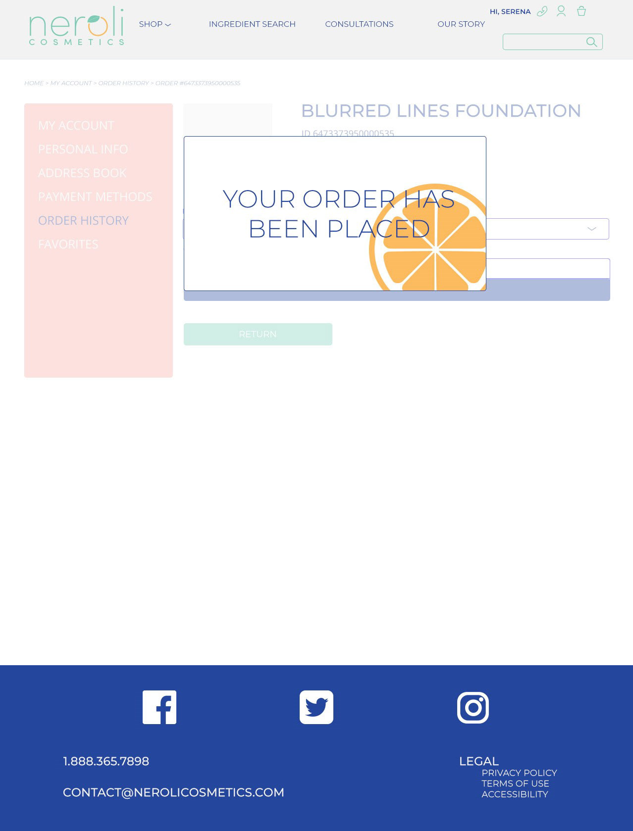
Final Pop-up
It’s always nice to see your name on something. By including the user’s name on the top nav, as well as keeping track of their milestones, we can create a more intimate experience.

web advertisements
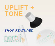
CUSTOMIZATION.
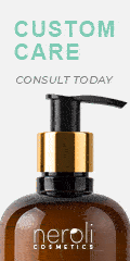
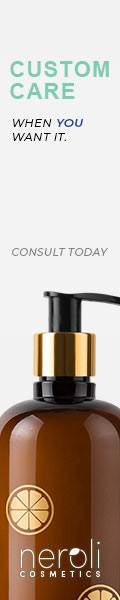

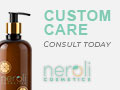
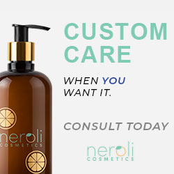
Advertising the customizable features of the company. Having a product that is personalizable is important to our company goals and brand feel.
In this ad, messaging was extremely important. The headline is the pop of color in most of the layouts, to draw attention to the company’s consultation feature.
PRODUCT FIRST.
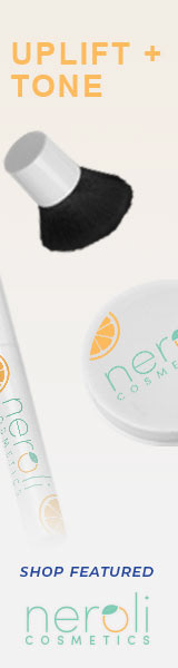
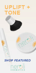

Advertising the properties of the featured products. The goal was to simplify the messaging, so the featured ingredient was cut out in favor of this. The color orange will be used for this group to simulate the refreshing feel.
Neroli prides itself on fresh ingredients. In this ad group, showcasing the products as the first line of sight was key here. We want to get the target audience interested in the products, then click the CTA.
REFRESH FOR SPRING.

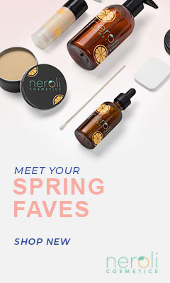
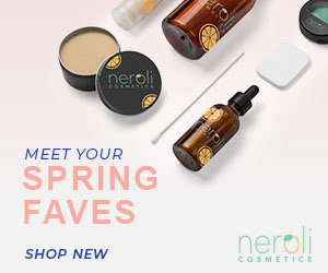


Advertising the new products for the season of spring. The color pink will be used, along with actual product imagery from the site.
In this ad, the new products for the season are being pushed here. The color pink was used, along with actual product imagery from the site to show the blush of spring.