GOOD GARDENING JUST GOT BETTER.
Pike's is a plant nursery that goes beyond just plants. The people that work here love what they do, and they pride themselves on that.
Approachable, easy to talk to. They're like that neighbor that's super friendly, and always lets you borrow their tools.
MESSAGING
Service-oriented
"Helping hands"
Full-service
"Helping hands"
Full-service
FEEL
Friendly neighbor
Do-it-yourself
Passionate
Do-it-yourself
Passionate
NEW GROWTH WITH FAMILIARITY
One of Pike's goals was to expand client influx for spring, while highlighting their affordable, top-tier service staff. Competitors lacked a specialized, human touch.
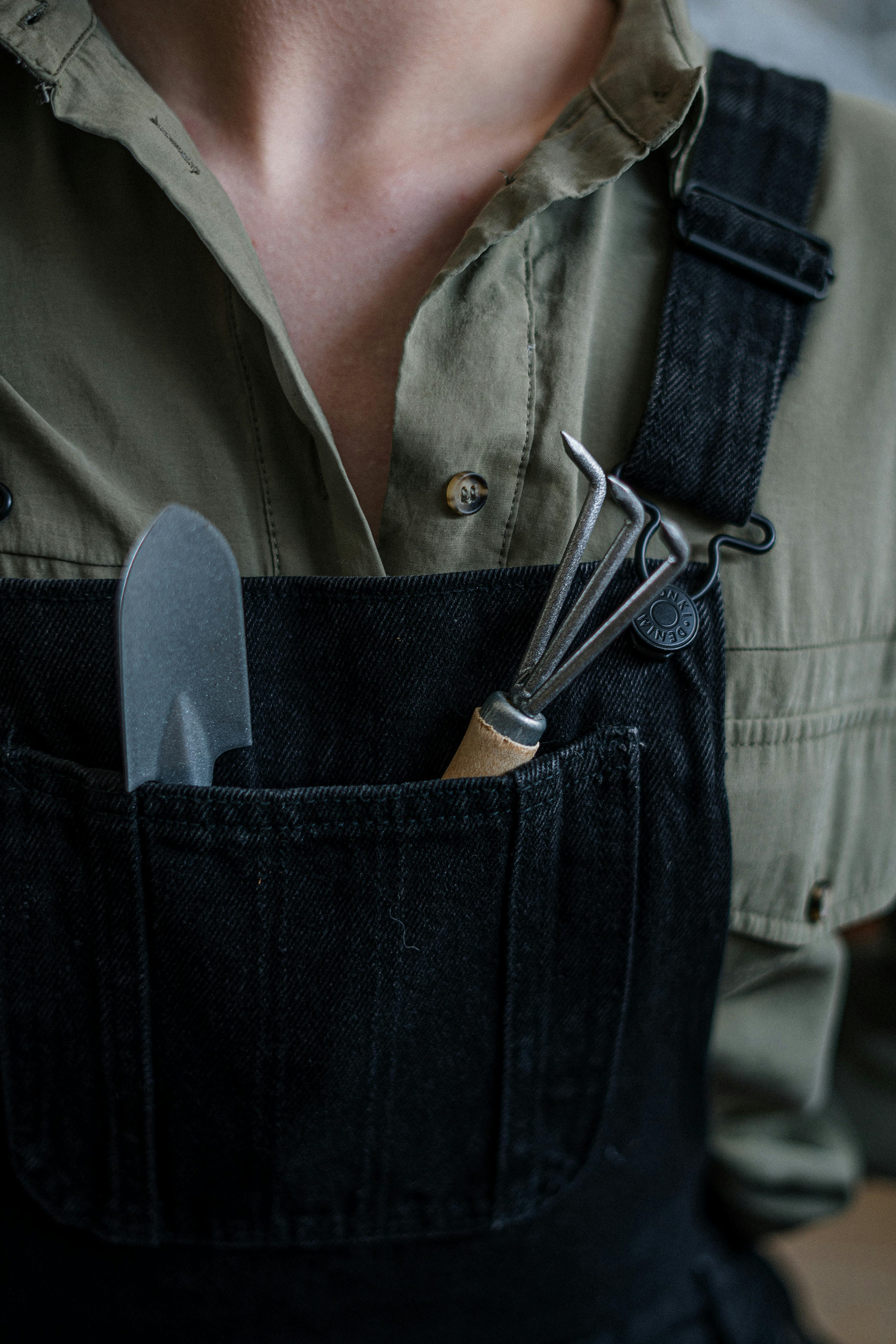
We leaned into inviting textures like ink, plants, and natural fibers.
Branding-wise, it was shown through timeless typographic choices.
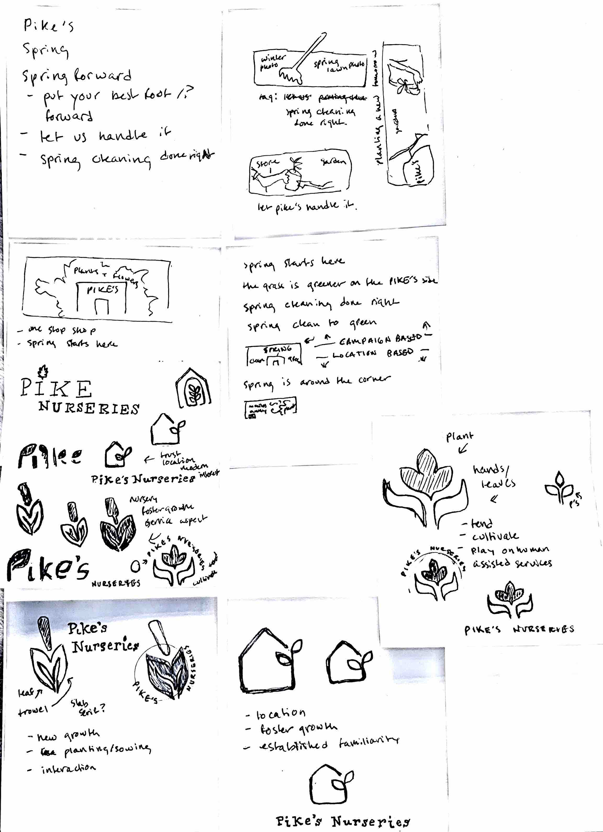
Initial Concepting of Voice
Type Exploration
branding in type
Based on the research into Pike's needs, competitors, and the brand feel, initial concepts involved the idea of "cultivating," "tending," and of course, plants as a motif. The iconography still felt too juvenile and "trendy" so exploring the type-based logo mark soon proved the way to go.
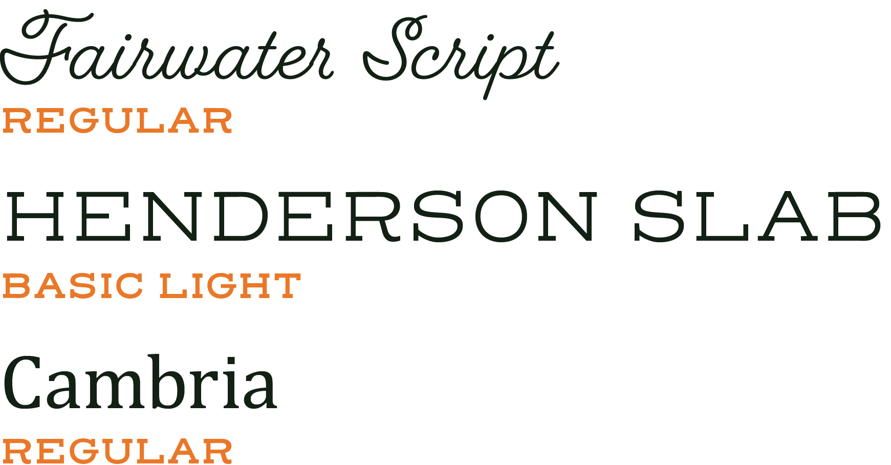
Pike's was clear on wanting to be a known and trusted brand, so adding a classic touch with a script typeface paired with a slab serif introduced that familiarity. The serif Cambria added a touch of modernity for the ads with an tall x-height and slightly round form.
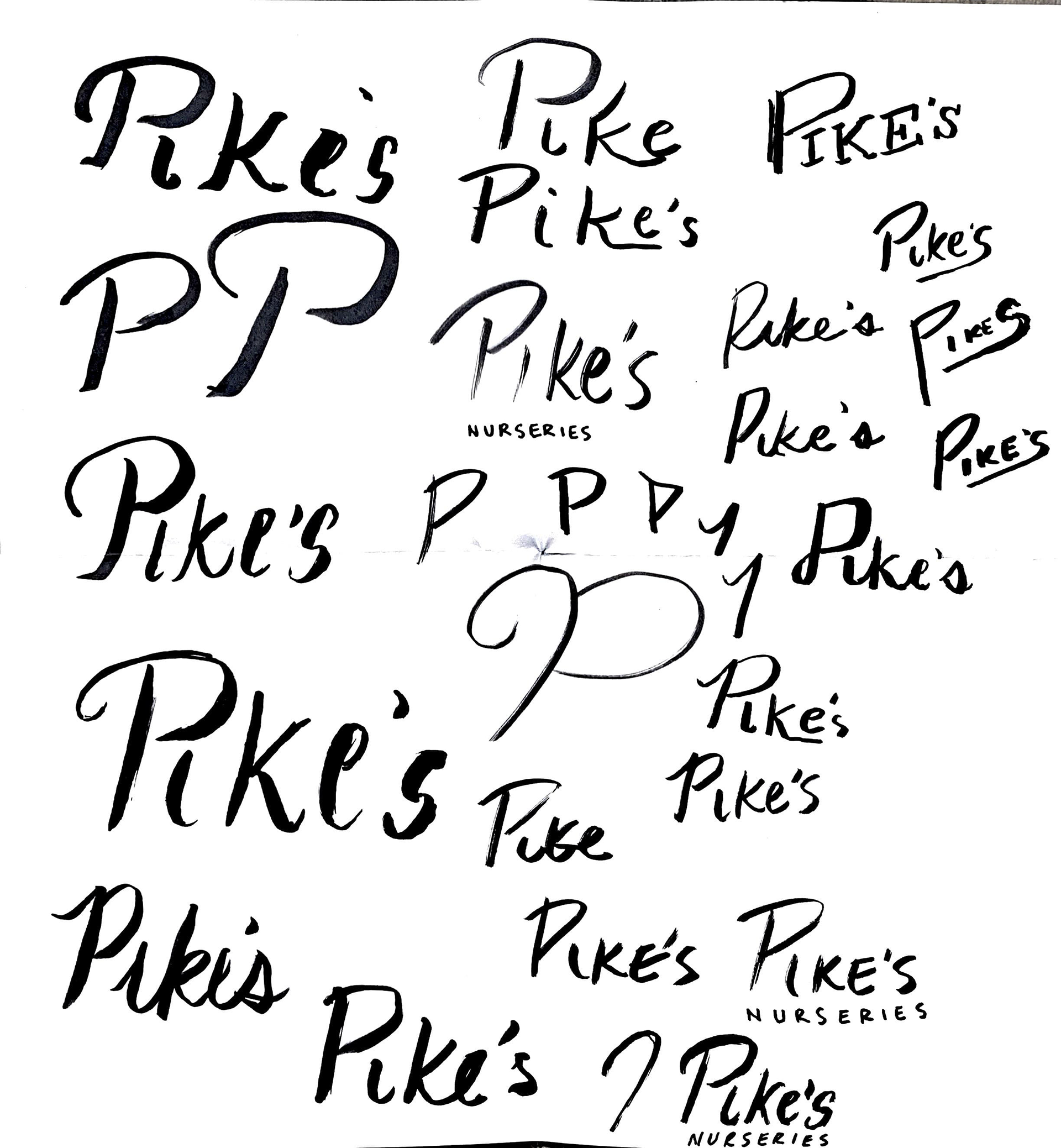
The initial drafts

from start to finish
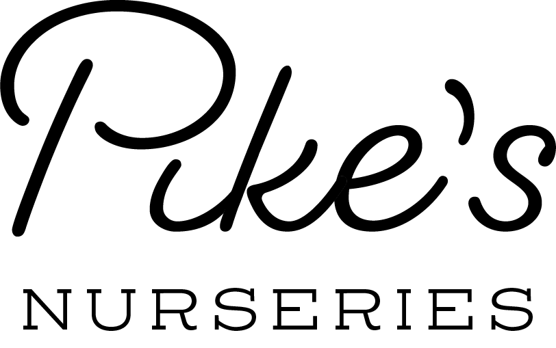
Utilizing Fairwater Script, the initial drafts involved seeing the letterforms and available ligatures, before some hand-customization was done. Letters were cut, pushed together, and hand-adjusted to create a completely unique logomark just for Pike's new brand feel.

logo concepts
tying it all together
final
2 Color
polishing up pike's

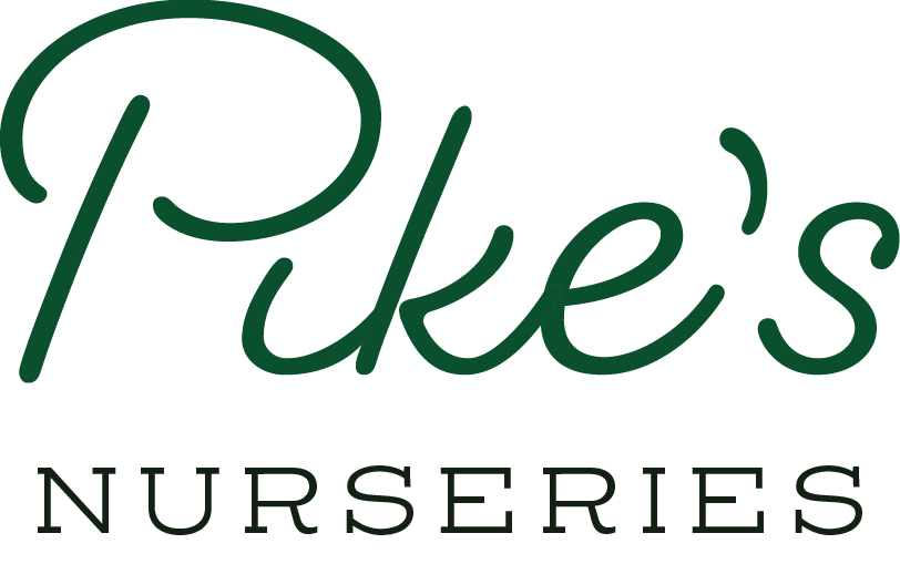
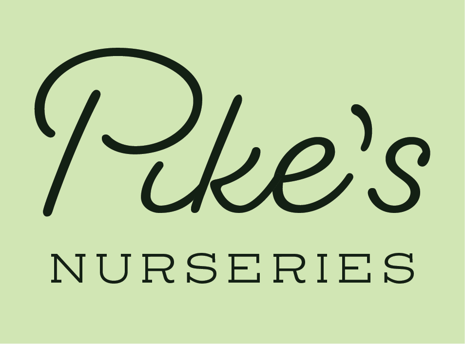
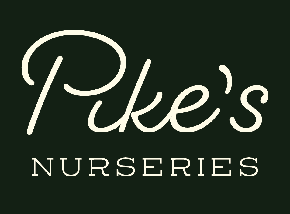
After the logomark was completed and framing text was chosen based on legibility, it was time to choose colors that said, "nurturing, trustworthy, and unique," all descriptor words that represented Pike's service and values.
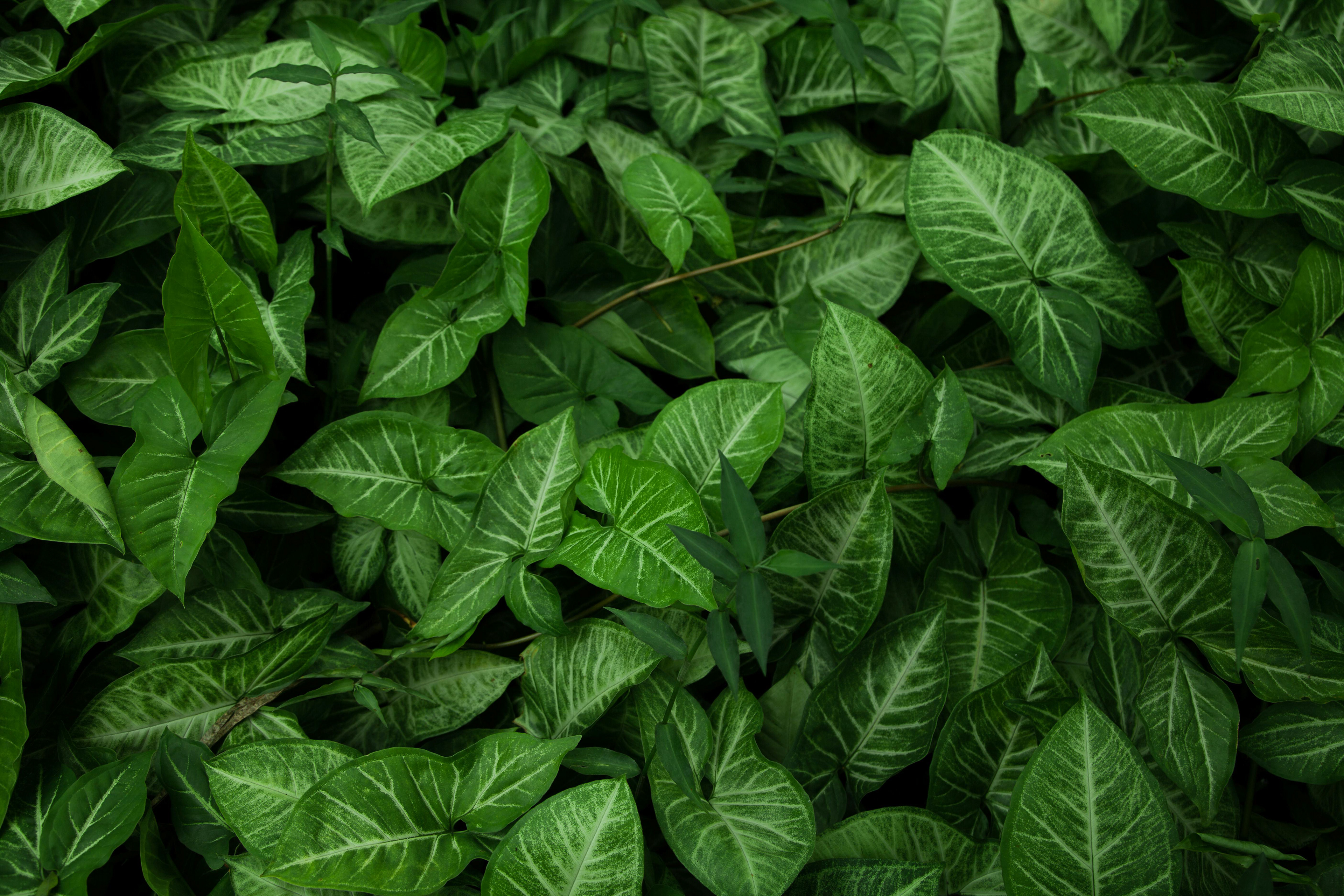
Shades of green were selected to invoke the color of plants and new growth, while cream and light green were selected as background/neutrals. Orange and pink serve as tertiary accents.
1 Color On Light
1 Color On Dark
Brand Colors
Framed Brand Colors
Framed B/W
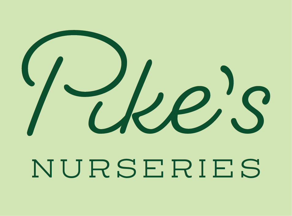
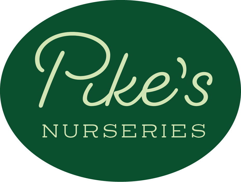
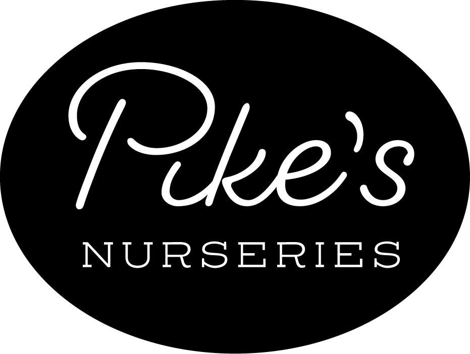
Pike's Nurseries now has a sleek and classic script based logo, with a slab serif as the framing text tying it together and grounding it. Here you can see some 1 and 2 color logo lock ups, utilizing the decided upon color palette.
growing some personality


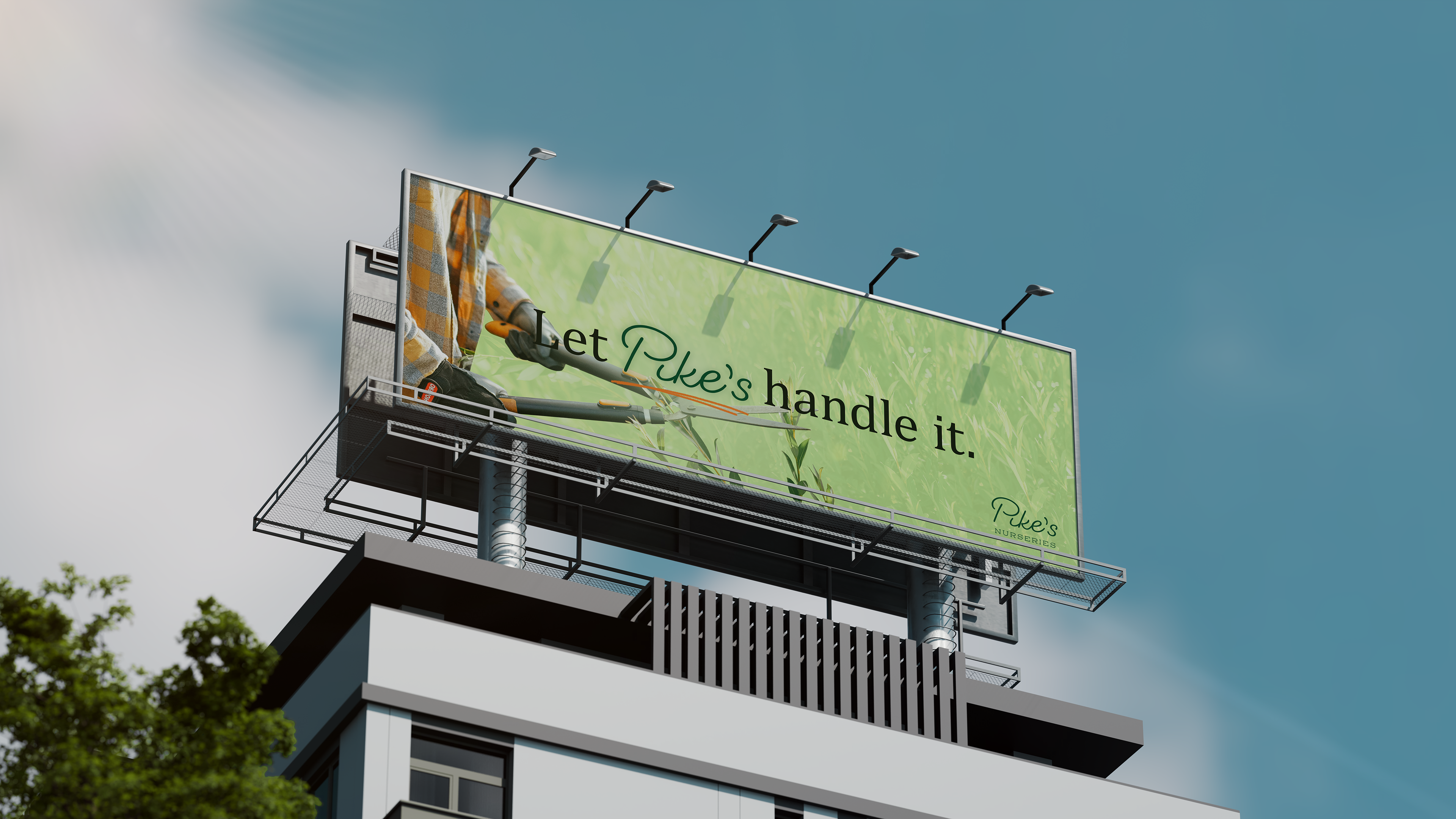
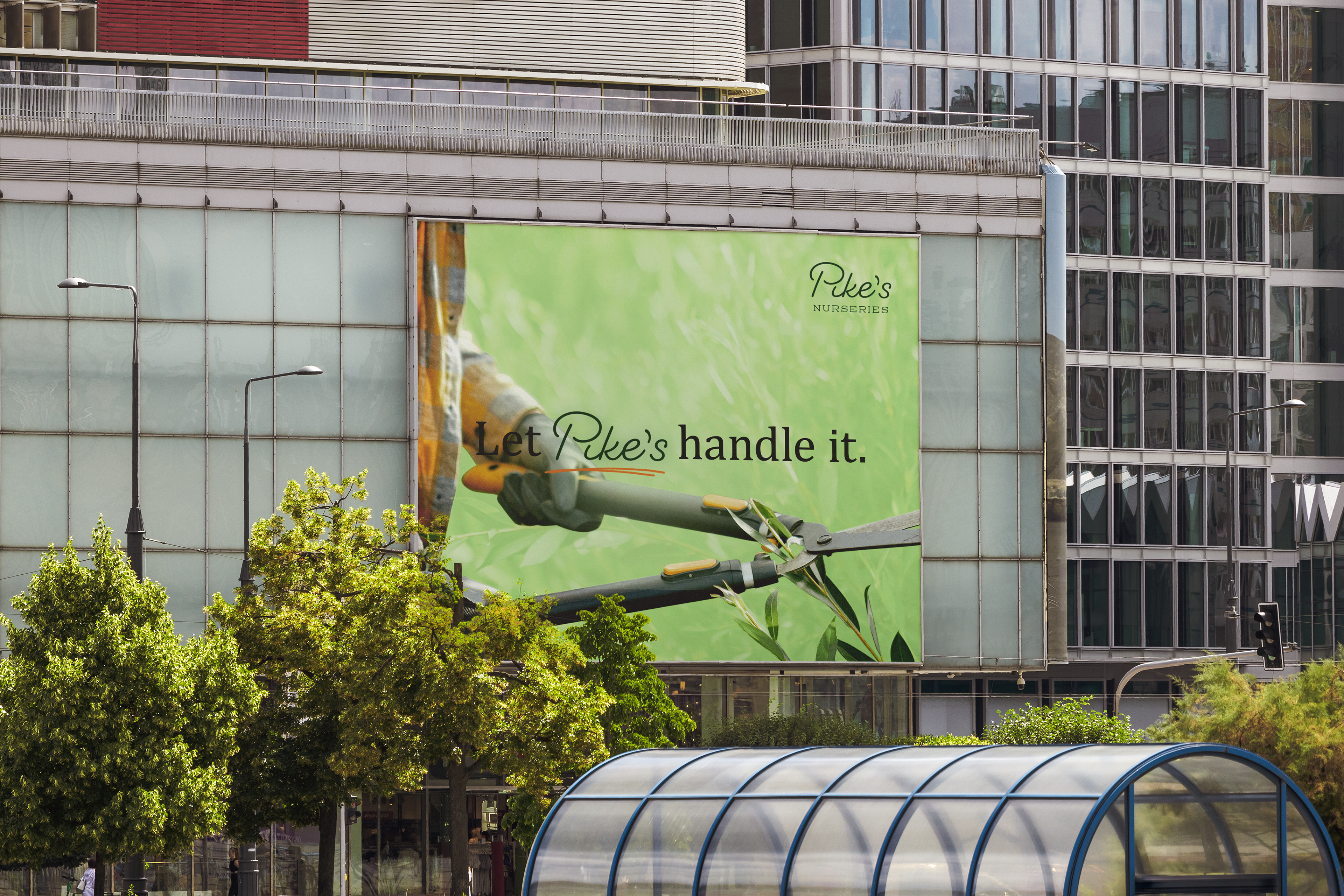
Pike's wants to build a trustworthy and reliable name for itself, while the campaign wanted to scream, "Spring!" Adding a slight hint of playfulness while emphasizing the taglines through illustrations tied it all together and breathed fresh air into this nursery OOH campaign.
assets in action


Showcasing the typography, colors, and illustrative elements together all at once.
spring has sprung.
Final results for the OOH campaign for Pike's nursery showcase the full-service nature of the business. They highlight fresh greenery and images of spring brought by illustrations and color.
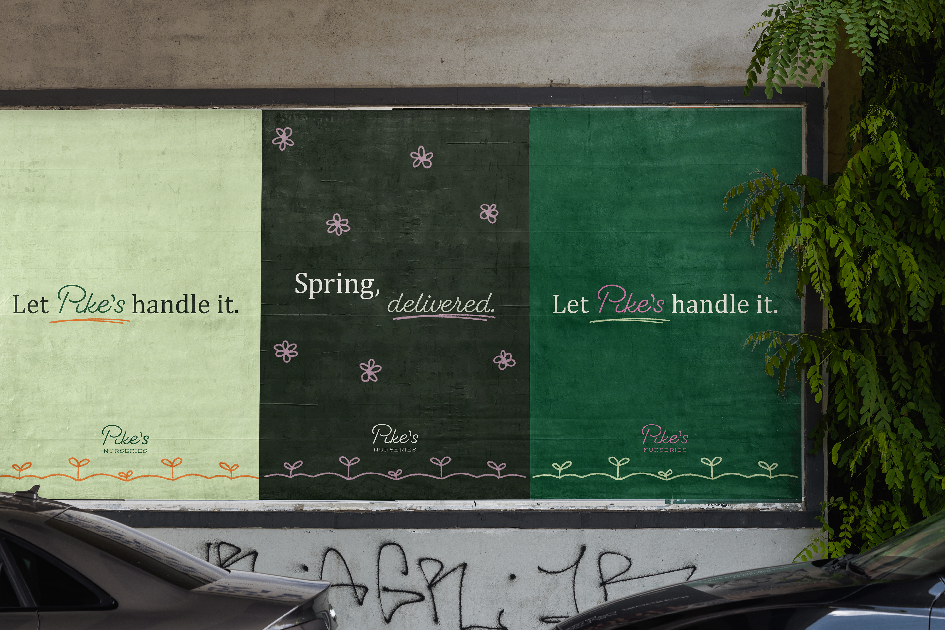
posters

transit ad
expanding to branding
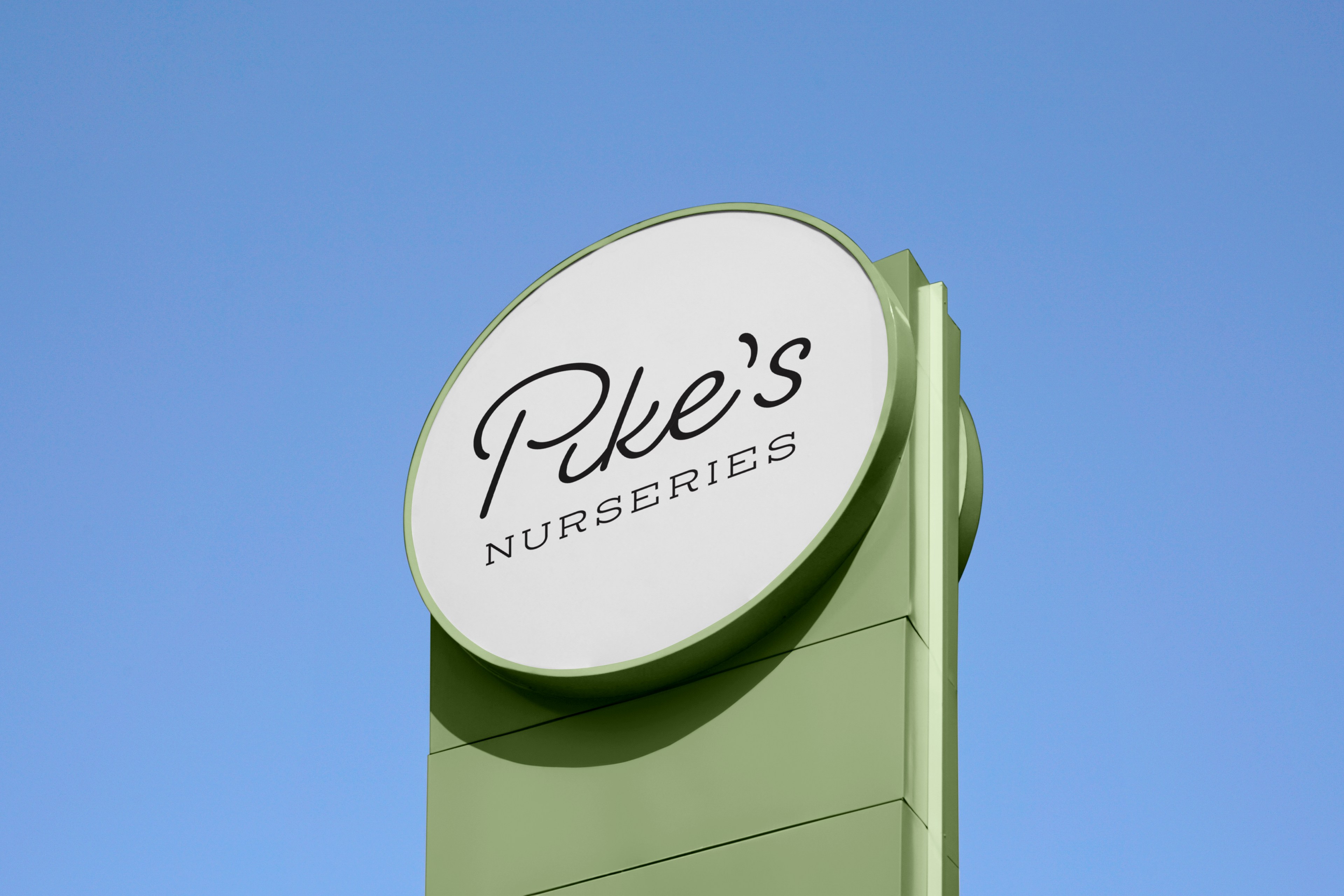
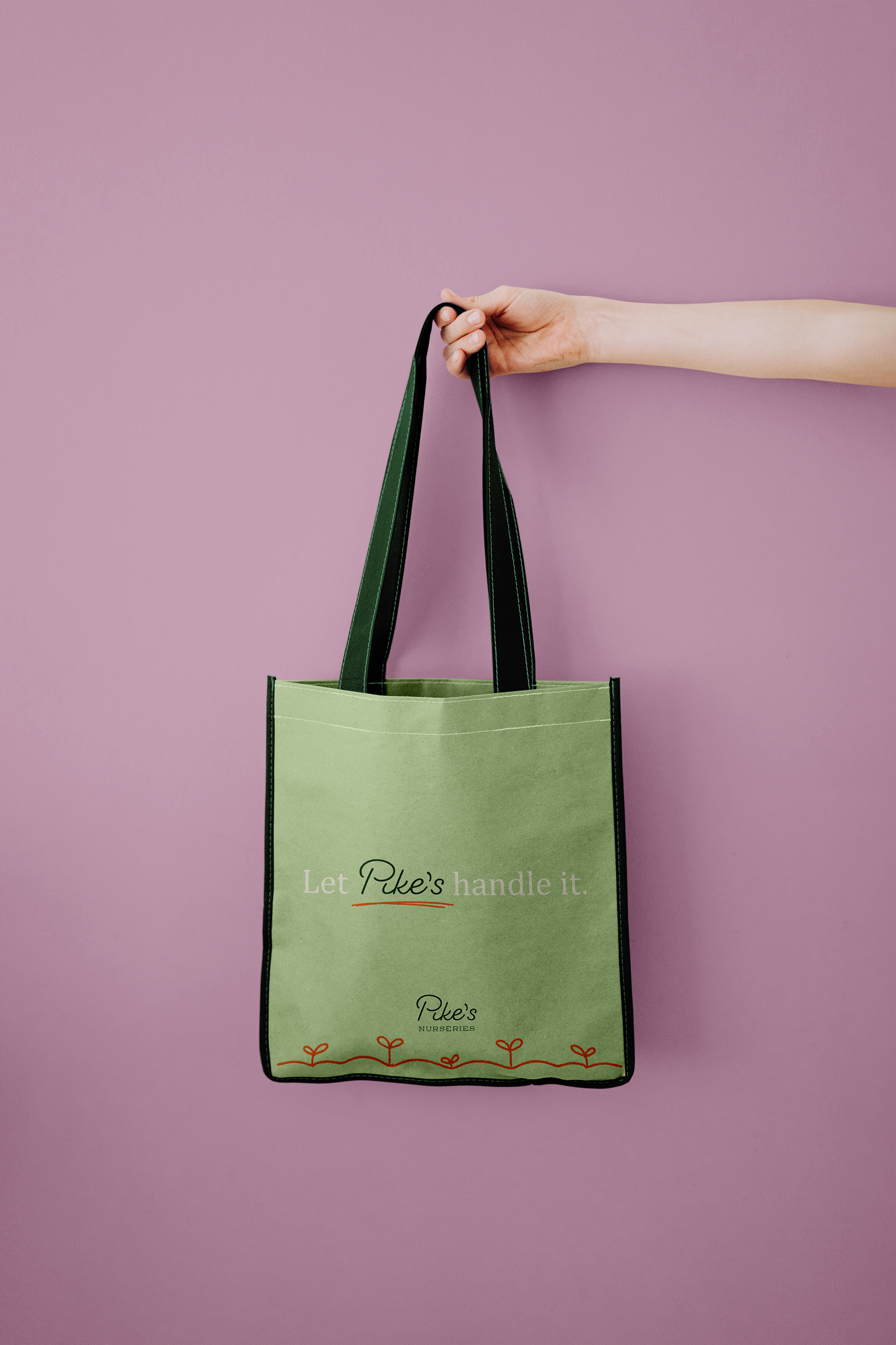
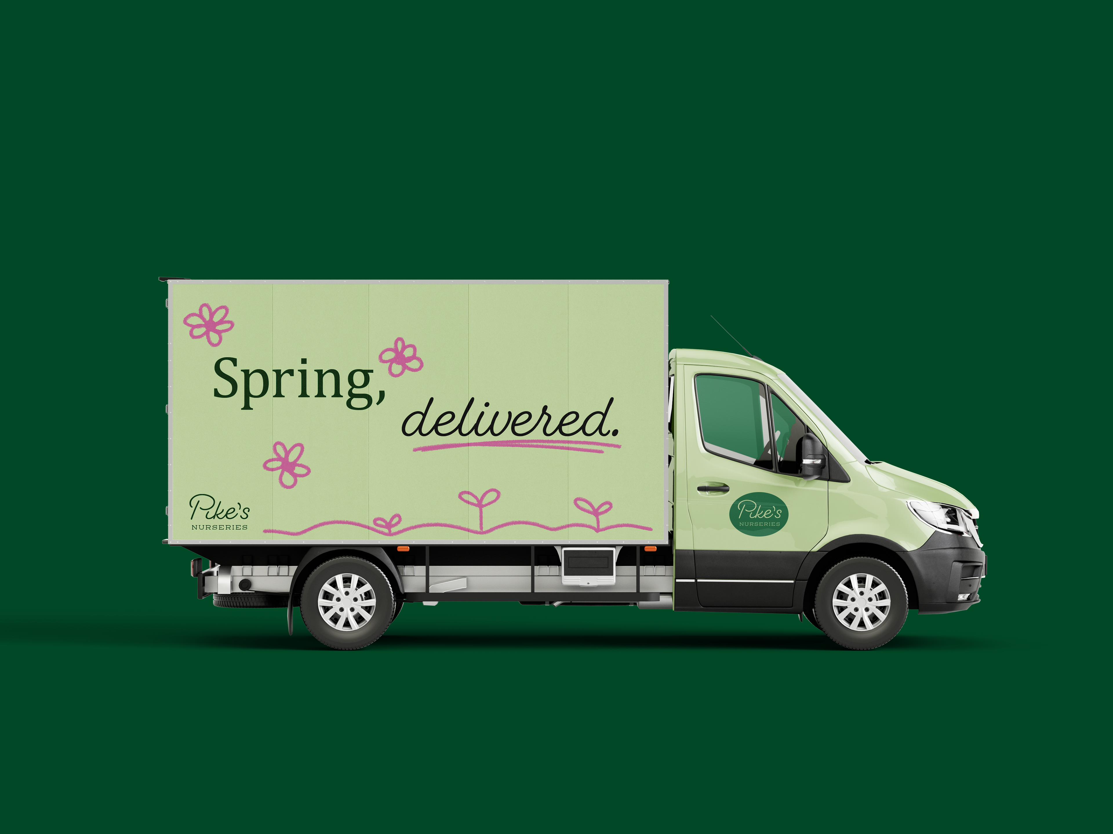
Stepping beyond just OOH, Pike's could utilize the campaign for a complete overhaul, showcasing delivery capabilities with a van wrap, branding in each store visit with a reusable tote, or a new store sign to welcome customers in.

If our work ethic aligns and you’d like to curate digital
solutions to your modern problems, let’s connect!
solutions to your modern problems, let’s connect!